Select Box

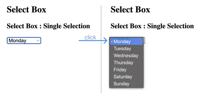
A select box, also called a drop-down list or pull-down list, is used to ask users to select one or multiple answers from listed options similar to radio buttons and checkboxes; however, options in the select box are hidden until users click on or tap the box.
To create a select box, use two tags: <select> and <option>. You need to nest the <option> elements within the <select> element.
Key Attributes
For the <select> tag:
name: This attribute is used to set a name for the select element. When you submit the form, the name is sent to the web server along with the value of the selected option. If there is no name in the tag, the selected value won’t be sent.
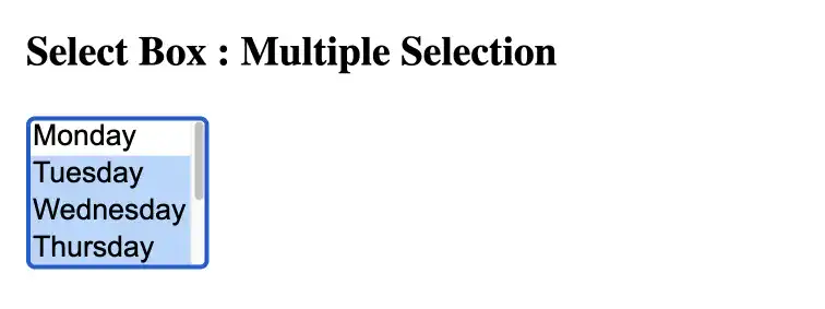
multiple: By adding this attribute, you can change a single selection select box to a multiple selection select box.
For the <option> tag:
value: This attribute is used to set a value of the option element. When you submit the form, the value is sent to the server along with the name of the select element.
selected: This attribute is used to set the initial setting of selection. The option with this attribute is already selected when a browser loads the web page.
Grouping Options
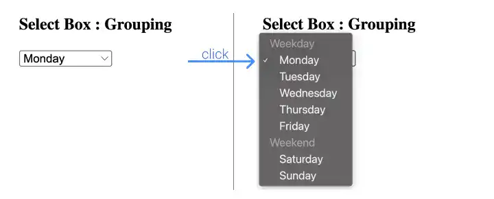
When you want to group options, you can use the <optgroup> tag with specifying a group name in the label attribute.
Practice
Objective:
Create select boxes in a different format
Single-selection Select Box
1. Add new code in the body section of the HTML document
- Open chapter6.html with VS Code (the file used in the previous practice)
- Add the following code before the
</body>tag
<h3>3. Select Box</h3>
<form>
  <h4>Select Box: Single Selection</h4>
  <select name="days-of-week">
    <option value="mon">Monday</option>
    <option value="tue">Tuesday</option>
    <option value="wed">Wednesday</option>
    <option value="thu">Thursday</option>
    <option value="fri">Friday</option>
    <option value="sat">Saturday</option>
    <option value="sun">Sunday</option>
  </select>
</form>
After editing the file, make sure that you save it (⌘ + S for Mac, Ctrl + S for Windows)
2. Check the result with a browser
- Open chapter6.html with a browser
- You'll see a single-selection select box like below.

Multi-selection Select Box
1. Add new code in the body section of the HTML document
- Add the following code after the code for the single selection select box.
- The code different from the single selection code is only adding the
multipleattribute and adjusting the title.
<form>
  <h4>Select Box: Multiple Selection</h4>
  <select name="days-of-week" multiple>
    <option value="mon">Monday</option>
    <option value="tue">Tuesday</option>
    <option value="wed">Wednesday</option>
    <option value="thu">Thursday</option>
    <option value="fri">Friday</option>
    <option value="sat">Saturday</option>
    <option value="sun">Sunday</option>
  </select>
</form>
After editing the file, make sure that you save it (⌘ + S for Mac, Ctrl + S for Windows).
2. Check the result with a browser
- Open chapter6.html with a browser
- You'll see a multi-selection select box like below.

Select Box with Grouping
1. Add new code in the body section of the HTML document
- Add the following code after the code for the multi-selection select box.
- The code different from the single selection code is only adding the
<optgroup>tag and adjusting the title.
<form>
  <h4>Select Box: Grouping</h4>
  <select name="days-of-week">
    <optgroup label="Weekday">
      <option value="mon">Monday</option>
      <option value="tue">Tuesday</option>
      <option value="wed">Wednesday</option>
      <option value="thu">Thursday</option>
      <option value="fri">Friday</option>
    </optgroup>
    <optgroup label="Weekend">
      <option value="sat">Saturday</option>
      <option value="sun">Sunday</option>
    </optgroup>
  </select>
</form>
After editing the file, make sure that you save it (⌘ + S for Mac, Ctrl + S for Windows).
2. Check the result with a browser
- Open chapter6.html with a browser.
- You'll see a select box with a grouping like below.

You can also check the sample result here (Demo Site).


