Chapter 15. CSS: Layout – Flex Box

Flex-basis

Flex-basis
Tag:

The flex-basis property specifies the initial length of a flex item. When x-axis is the main axis, flex-basis defines width. When y-axis is the main axis, flex-basis defines height. The default value of this property is auto. If you don't specify this property, the width or height set for the flex item will be applied. The benefit of this property is that you can set the length of each flex item regardless of the main axis direction of the Flex Box.

When the horizontal axis is the main axis

The flex-basis property behaves like the width property in the illustration below. If both width and flex-basis values are set, the value of the flex-basis is prioritized.

flex-basis

When the vertical axis is the main axis

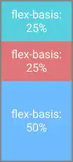
When you specify column or column-reverse in flex-direction, the vertical axis becomes the main axis. Under this situation, the flex-basis property behaves like the height property in the illustration below. If both height and flex-basis values are set, the value of the flex-basis is prioritized.
flex-basis

Ideaflex

The flex property is a shorthand property for flex-grow, flex-shrink, and flex-basis. This property will prove useful once you master the concepts of flex-grow, flex-shrink, and flex-basis, but it would be better for you to familiarize yourself each concept first.

flex-basis

Practice

Objective:
Check how the flex-basis property works

1. Update the body section of the HTML file

Add the code below in the <body> section of the chapter15.html file. We are creating two cases to test flex-basis: 1) the horizontal axis is the main axis and 2) the vertical axis is the main axis.

chapter15.html
<h2>flex-basis</h2>
<h3>Original Flex Item Size - Horizontal Layout</h3>
<div class="flex-container-no-padding">
  <div class="flex-item-to-grow-1"></div>
  <div class="flex-item-to-grow-2"></div>
  <div class="flex-item-to-grow-3"></div>
</div>

<h3>Horizontal Layout with flex-basis</h3>
<div class="flex-container-no-padding">
  <div class="flex-item-to-grow-1" style="flex-basis: 25%">flex-basis: 25%</div>
  <div class="flex-item-to-grow-2" style="flex-basis: 25%">flex-basis: 25%</div>
  <div class="flex-item-to-grow-3" style="flex-basis: 50%">flex-basis: 50%</div>
</div>

<h3>Original Flex Item Size - Vertical Layout</h3>
<div class="flex-container-no-padding" style="flex-direction: column; height: 500px; width: 50px;">
  <div class="flex-item-to-grow-1"></div>
  <div class="flex-item-to-grow-2"></div>
  <div class="flex-item-to-grow-3"></div>
</div>

<h3>Vertical Layout with flex-basis</h3>
<div class="flex-container-no-padding" style="flex-direction: column; height: 500px; width: 50px;">
  <div class="flex-item-to-grow-1" style="flex-basis: 25%">flex-basis: 25%</div>
  <div class="flex-item-to-grow-2" style="flex-basis: 25%">flex-basis: 25%</div>
  <div class="flex-item-to-grow-3" style="flex-basis: 50%">flex-basis: 50%</div>
</div>
<hr>

2. Check the result with a browser

  • Open chapter15.html with a browser.
  • You can see how the same flex-basis property value works when the main axis changes from the horizontal direction to the vertical direction.

You can also check the sample result here (Demo Site link).

link demo code

Tag: