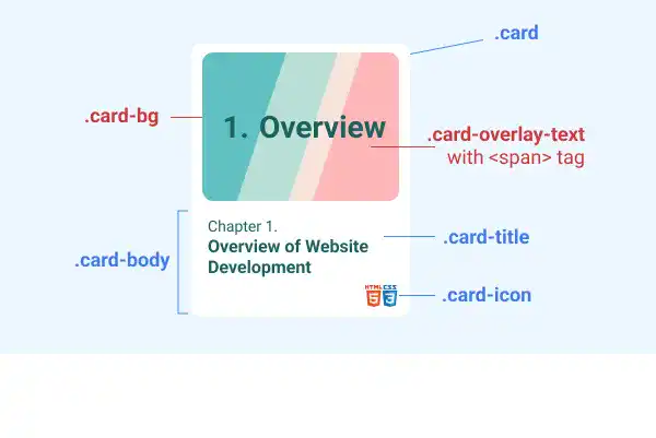
Chapter 17. CSS: Styling Components

Cards

Cards
Tag:

Styling cards look complicated but creating them is not difficult once you understand the structure of HTML elements and CSS key properties. As you can quickly implement well-styled card components using CSS libraries such as Bootstrap, you can skip this lesson; however, mastering card styling can help improve your design flexibility skills.

In this lesson, we'll explain how to create and style cards with case examples.

Case 1: Card with an image and button

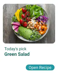
This is the target design for this case example.
Cards

First, you need to structure the elements of the card using HTML. There are three layers, and you need to assign classes to manage each layer.

  • 1st layer: The card itself using the card class
  • 2nd layer: The image and the body of the card using the card-img and card-body classes
  • 3rd layer (under the card body part): The card title and button using card-title and card-btn classes


Here is the HTML example code. For layout and visibility purposes, we are directly adding the display and background-color properties to the parent element in the HTML code. Also, we are making the parent element Flex Box, so we can to coordinate positions of multiple cards later on.

HTML
<div style="display: flex; background-color: azure;">
  <div class="card">
    <div class="card-img"></div>
    <div class="card-body">
      <div class="card-title"><small>Todays's Pick</small></br><b>Green Salad</b></div>
      <a href="#" class="card-btn">Open Recipe</a>
    </div>
  </div>
</div>

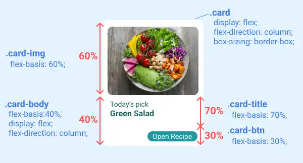
After having written the HTML code, you need to add CSS properties to each class. The most important part is handling element layout. The Flex Box approach is utilized to manage the element layout. Using flex-direction: column, you can vertically structure the element, and using flex-basis, you can define the proportion of each element. In this case, there are two levels for setting the proportions:

  • First, split into 60:40
  • Then, split the part of 40 into 70:30

See the illustration below about key CSS properties for the card element layout.
Cards

Besides the layout, there are several properties that you need to set for each element. We'll explain them layer by layer.

1st layer styling

The first layer is the card itself. You can decide the size (width and height), background color (background-color), shape (border-radius), and spacing (margin and padding). The border-box property is also used to make sure that card sizes stay the same regardless of border width and padding size.

CSS
.card{
  width: 200px;
  height: 250px;
  background-color: white;
  border-radius: 10px;
  margin: 10px;
  padding: 10px;
  display: flex;
  flex-direction: column;
  box-sizing: border-box;
}

2nd layer styling

The second layer consists of the card image and the card body. As explained, this layer is split at a 60:40 ratio with the flex-basis property.

For the card image, we set background image properties and border-radius.

No additional setting for the card body is required besides layout-related properties as most stylings will be covered in the third layer.

CSS
.card-img{
  flex-basis: 60%;
  background: url(img/salad.jpg) center center/cover no-repeat;
  border-radius: 10px;
}

.card-body{
  flex-basis:40%;
  display: flex;
  flex-direction: column;
}

3rd layer styling

The third layer consists of the card title and card button. As explained, this layer is split at a 70:30 ratio with the flex-basis property.

For the card title, padding is added to adjust the position of the text.

For the card button, several properties are added to create a button style. Refer to the previous topic to understand how to make buttons. Usually, you can use .card-btn class selector only, but in this case, we are using the descendant selector (a combination of .card-body and .card-btn) to increase specificity to make sure the additional styles are properly applied.

CSS
.card-title{
  flex-basis: 70%;
  padding: 5px;
}

.card-body .card-btn{
  flex-basis: 30%;
  background-color:#2197A2;
  color: white;
  border-style: none;
  border-radius: 15px;
  width: 100px;
  height: 20px;
  font-size: 0.8rem;
  font-family: roboto, sans-serif;
  text-decoration: none;
  margin-left:auto;
  display: flex;
  justify-content: center;
  align-items: center;
}

Case 2: Card with a hyperlink

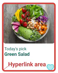
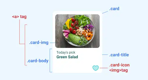
This is the target design for this case example. The design is almost the same as in the previous case. The only change in styling is that the button is replaced with the "Like" icon. The main difference is the hyperlink area. We'll add the hyperlink to the card image and the card body.
Cards

To modify the card created in the first case to this case, you need to adjust the HTML code first:

  • Replace the button with the Like icon
  • Add <a> tag to nest the card title and the card body
Cards

HTML
<div style="display: flex; background-color: azure;">
  <div class="card">
    <a href="#">
      <div class="card-img"></div>
      <div class="card-body">
        <div class="card-title"><small>Todays's Pick</small></br><b>Green Salad</b></div>
        <div class="card-icon"><img src="img/like.svg"></div>
      </div>
    </a>
  </div>
</div>

Then, add CSS code to the new tag and classes.

For the <a> tag, use the descendant selector to avoid potential impact to other elements. In this case, add style only to the <a> tag under the card class. As we are inserting another layer in the Flex Box nesting structure, we are also adding Flex Box-related properties.

  • As the <a> element is the only element in the second layer now, set at 100% for the flex-basis property.
  • Add the display and flex-direction properties to nest the third layer elements using Flex Box with a vertical orientation.
  • Set text-decoration: none to eliminate the underline.

For the card icon, add Flex Box-related properties to adjust the position of the icon. Also, set the image size for the <img> tag under the card-icon class.

CSS
.card a{
  color:#196060;
  flex-basis: 100%;
  display: flex;
  flex-direction: column;
  text-decoration: none;
}

.card-icon{
  flex-basis: 30%;
  display: flex;
  justify-content: flex-end;
  align-items: flex-end;
}

.card-icon img{
  height: 20px;
}

Case 3: Card with text and image overlay

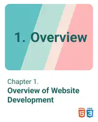
The image below is a target design for this case example. In this case, we are using an image background and adding text onto the image.
Cards

Here are the key changes from the previous case in the HTML code.

  • Replace the card-img class with the card-bg class.
  • Add the card-overlay-text class using the <span> tag to adjust the overlay text styling.
  • Adjust the title text.
  • Adjust the icon image.

Cards

HTML
<div style="display: flex; background-color: azure;">
  <div class="card">
    <a href="#">
      <div class="card-bg">
        <span class="card-overlay-text">1. Overview</span>
      </div>
      <div class="card-body">
        <div class="card-title"><small>Chapter 1.</small><br><b> Overview of Website Development</b></div>
        <div class="card-icon"><img src="img/html5.png"><img src="img/css3.png"></div>
      </div>
    </a>
  </div>
</div>

Add CSS properties to the card-bg and the card-overlay-text classes.

For the card-bg class, use almost the same properties as the ones of the card-img class but add Flex Box properties to nest the overlay text.

For the card-overlay-text class, set font properties and Flex Box properties to adjust the text position.

CSS
.card-bg{
  flex-basis: 70%;
  background: url(img/card-bg.png) center center/cover no-repeat;
  border-radius: 10px;
  display: flex;
  justify-content: center;
}

.card-overlay-text{
  font-size: 1.8rem;
  font-weight: bold;
  display: flex;
  align-items: center;
  justify-content: center;
}

Case 4: Card with different design

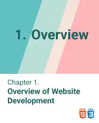
You can also customize the card design by simply adjusting border-radius and padding.

This is a target design for this case example.
Cards

In this case, we adjust the card style only using an inline stylesheet in an HTML document.

Using the previous case, with only three adjustments, you can achieve the target design.

  • Adjust border-radius and padding (eliminate top, left, and right paddings) in the element with the card class.
  • Adjust border-radius for the element with the card-bg class.
  • Adjust padding-left for the element with the card-icon class (adding 10px padding as the left padding is eliminated from the card itself)
HTML
<div style="display: flex; background-color: azure;">
  <div class="card" style="border-radius: 0; padding: 0px 0px 10px 0px;">
    <a href="#">
      <div class="card-bg" style="border-radius: 0;">
        <span class="card-overlay-text">1. Overview</span>
      </div>
      <div class="card-body">
        <div class="card-title"><small>Chapter 1.</small><br><b> Overview of Website Development</b></div>
        <div class="card-icon" style="padding-right:10px;"><img src="img/html5.png"><img src="img/css3.png"></div>
      </div>
    </a>
  </div>
</div>

Practice

Objective:
Create and style cards with different designs

1. Prepare image files

In this practice, we prepare two images. You can get images from free image download services. Check Tips: Preparing Image Files .

2. Update the body section of the HTML file

Add the code below in the <body> section of the chapter17.html file.

chapter17.html
<h2 style="text-align: center;">Cards</h2>
<div style="display: flex; justify-content: center; flex-wrap: wrap; padding: 20px; background-color: azure;">
  <div class="card">
    <div class="card-img"></div>
    <div class="card-body">
      <div class="card-title"><small>Todays's Pick</small></br><b>Green Salad</b></div>
      <a href="#" class="card-btn">Open Recipe</a>
    </div>
  </div>
  <div class="card">
    <a href="#">
      <div class="card-img"></div>
      <div class="card-body">
        <div class="card-title"><small>Todays's Pick</small></br><b>Green Salad</b></div>
        <div class="card-icon"><img src="img/like.svg"></div>
      </div>
    </a>
  </div>
  <div class="card">
    <a href="#">
      <div class="card-bg">
        <span class="card-overlay-text">1. Overview</span>
      </div>
      <div class="card-body">
        <div class="card-title"><small>Chapter 1.</small><br><b> Overview of Website Development</b></div>
        <div class="card-icon"><img src="img/html5.png"><img src="img/css3.png"></div>
      </div>
    </a>
  </div>
  <div class="card" style="border-radius: 0; padding: 0px 0px 10px 0px;">
    <a href="#">
      <div class="card-bg" style="border-radius: 0;">
        <span class="card-overlay-text">1. Overview</span>
      </div>
      <div class="card-body">
        <div class="card-title"><small>Chapter 1.</small><br><b> Overview of Website Development</b></div>
        <div class="card-icon" style="padding-right:10px;"><img src="img/html5.png"><img src="img/css3.png"></div>
      </div>
    </a>
  </div>
</div>
<hr>

3. Update CSS

Open the component.css file and add new code to style each card.

component.css
/* Cards */
.card{
  width: 200px;
  height: 250px;
  background-color: white;
  border-radius: 10px;
  margin: 10px;
  padding: 10px;
  display: flex;
  flex-direction: column;
  box-sizing: border-box;
}

.card-img{
  flex-basis: 60%;
  background: url(../img/salad.jpg) center center/cover no-repeat;
  border-radius: 10px;
}

.card-body{
  flex-basis:40%;
  display: flex;
  flex-direction: column;
}

.card-title{
  flex-basis: 70%;
  padding: 5px;
}

.card-body .card-btn{
  flex-basis: 30%;
  background-color:#2197A2;
  color: white !important;
  border-style: none;
  border-radius: 15px;
  width: 100px;
  height: 20px;
  font-size: 0.8rem;
  font-family: roboto, sans-serif;
  text-decoration: none;
  margin-left:auto;
  display: flex;
  justify-content: center;
  align-items: center;
}

.card a{
  color:#196060;
  flex-basis: 100%;
  display: flex;
  flex-direction: column;
  text-decoration: none;
}

.card-icon{
  flex-basis: 30%;
  display: flex;
  justify-content: flex-end;
  align-items: flex-end;
}

.card-icon img{
  height: 20px;
}

.card-bg{
  flex-basis: 70%;
  background: url(../img/card-bg.png) center center/cover no-repeat;
  border-radius: 10px;
  display: flex;
  justify-content: center;
}

.card-overlay-text{
  font-size: 1.8rem;
  font-weight: bold;
  display: flex;
  align-items: center;
  justify-content: center;
}

4. Check the result with a browser

Open chapter17.html with a browser. You can see various card designs.

You can also check the sample result here (Demo Site link).

link demo code

Tag: