Chapter 15. CSS: Layout – Flex Box

Flex-wrap

Flex-wrap
Tag:

The flex-wrap is used for setting the behavior of flex items when their total width exceeds the flex container (the parent element).

no-wrap

This is the default setting. When the flex items' width is fixed and the total width of the flex items (including the width of content, paddings, borders, and margins) exceeds the container, the flex items overflow the container.

flex-wrap

wrap

With this property value, the flex items are wrapped and flow downwards when the total width of the flex items exceeds the flex container.

flex-wrap

wrap-reverse

With this property value, flex items are wrapped and flow upwards when the total width of the flex items exceeds the flex container.

flex-wrap

Ideaflex-flow

The flex-flow property is a shorthand property for flex-direction and flex-wrap. You can specify two keywords with a space in between.

flex-wrap

Practice

Objective:
Check how the flex-wrap property works

1. Update the body section of the HTML file

Add the code below in the <body> section of the chapter15.html file. We are using the same classes we set before. There is no need to set new classes.

chapter15.html
<h2>flex-wrap</h2>
<h3>flex-wrap: nowrap</h3>
<div class="flex-container" style="display: flex; flex-wrap:nowrap">
  <div class="flex-item">item 1</div>
  <div class="flex-item">item 2</div>
  <div class="flex-item">item 3</div>
  <div class="flex-item">item 4</div>
  <div class="flex-item">item 5</div>
  <div class="flex-item">item 6</div>
  <div class="flex-item">item 7</div>
</div>

<h3>flex-wrap: no-wrap</h3>
<div class="flex-container" style="display: flex; flex-wrap: wrap">
  <div class="flex-item">item 1</div>
  <div class="flex-item">item 2</div>
  <div class="flex-item">item 3</div>
  <div class="flex-item">item 4</div>
  <div class="flex-item">item 5</div>
  <div class="flex-item">item 6</div>
  <div class="flex-item">item 7</div>
</div>

<h3>flex-wrap: wrap-reverse</h3>
<div class="flex-container" style="display: flex; flex-wrap: wrap-reverse;">
  <div class="flex-item">item 1</div>
  <div class="flex-item">item 2</div>
  <div class="flex-item">item 3</div>
  <div class="flex-item">item 4</div>
  <div class="flex-item">item 5</div>
  <div class="flex-item">item 6</div>
  <div class="flex-item">item 7</div>
</div>
<hr>

2. Check the result with a browser

  • Open chapter15.html with a browser.
  • You can see different flex-wrap results. In this case, by wrapping flex items, you can prevent the flex items from overflowing the container.

You can also check the sample result here (Demo Site link).

link demo code

Ideano-wrap when the width of flex items is not specified

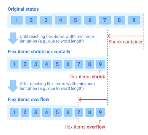
If you don't specify the width of flex items, their width can change depending on the container width and content width (e.g., word length). In this case, the behavior of the flex items in the flex-wrap: no-wrap (default) setting can be slightly complex.

When the total width of the flex items (including the width of content, paddings, borders, and margins) exceeds the container, the flex items shrink horizontally first until the minimum width limitation of the flex items (for example, a word length) is reached.

Then, after reaching the point where the flex items cannot shrink anymore, the flex items start to overflow the container.
flex-wrap

The flex-wrap is used for setting the behavior of flex items when their total width exceeds the flex container (the parent element).

no-wrap

This is the default setting. When the flex items' width is fixed and the total width of the flex items (including the width of content, paddings, borders, and margins) exceeds the container, the flex items overflow the container.

flex-wrap

wrap

With this property value, the flex items are wrapped and flow downwards when the total width of the flex items exceeds the flex container.

flex-wrap

wrap-reverse

With this property value, flex items are wrapped and flow upwards when the total width of the flex items exceeds the flex container.

flex-wrap

Ideaflex-flow

The flex-flow property is a shorthand property for flex-direction and flex-wrap. You can specify two keywords with a space in between.

flex-wrap

Practice

Objective:
Check how the flex-wrap property works

1. Update the body section of the HTML file

Add the code below in the <body> section of the chapter15.html file. We are using the same classes we set before. There is no need to set new classes.

chapter15.html
<h2>flex-wrap</h2>
<h3>flex-wrap: nowrap</h3>
<div class="flex-container" style="display: flex; flex-wrap:nowrap">
  <div class="flex-item">item 1</div>
  <div class="flex-item">item 2</div>
  <div class="flex-item">item 3</div>
  <div class="flex-item">item 4</div>
  <div class="flex-item">item 5</div>
  <div class="flex-item">item 6</div>
  <div class="flex-item">item 7</div>
</div>

<h3>flex-wrap: no-wrap</h3>
<div class="flex-container" style="display: flex; flex-wrap: wrap">
  <div class="flex-item">item 1</div>
  <div class="flex-item">item 2</div>
  <div class="flex-item">item 3</div>
  <div class="flex-item">item 4</div>
  <div class="flex-item">item 5</div>
  <div class="flex-item">item 6</div>
  <div class="flex-item">item 7</div>
</div>

<h3>flex-wrap: wrap-reverse</h3>
<div class="flex-container" style="display: flex; flex-wrap: wrap-reverse;">
  <div class="flex-item">item 1</div>
  <div class="flex-item">item 2</div>
  <div class="flex-item">item 3</div>
  <div class="flex-item">item 4</div>
  <div class="flex-item">item 5</div>
  <div class="flex-item">item 6</div>
  <div class="flex-item">item 7</div>
</div>
<hr>

2. Check the result with a browser

  • Open chapter15.html with a browser.
  • You can see different flex-wrap results. In this case, by wrapping flex items, you can prevent the flex items from overflowing the container.

You can also check the sample result here (Demo Site link).

link demo code

Ideano-wrap when the width of flex items is not specified

If you don't specify the width of flex items, their width can change depending on the container width and content width (e.g., word length). In this case, the behavior of the flex items in the flex-wrap: no-wrap (default) setting can be slightly complex.

When the total width of the flex items (including the width of content, paddings, borders, and margins) exceeds the container, the flex items shrink horizontally first until the minimum width limitation of the flex items (for example, a word length) is reached.

Then, after reaching the point where the flex items cannot shrink anymore, the flex items start to overflow the container.

flex-wrap

Tag: