Chapter 15. CSS: Layout – Flex Box

Nested Flex Box

Nested Flex Box
Tag:

A Flex Box can be nested by another Flex Box, and you can create a multi-layer nesting structure using Flex Box. This is a very helpful feature in website layout design.

Case 1: 3-layer nesting structure

You can create a nested Flex Box by simply nesting a Flex Box under another Flex Box. If you don't specify flex-direction, the flex containers are horizontally separated like in the illustration below. To set the widths of nested containers, it is better to use flex-basis as it gives you the flexibility to change flex-direction later on. In the illustration, flex-basis for the nested containers is all 50%.
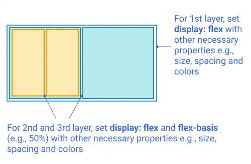
Nested-Flex-Box

IdeaContent position alignment

One of the major benefits of using Flex Box is to make content positioning easier. For example, if you want to put content (e.g., text) in the center of the 3rd layer container, you can set justify-content: center and align-items: center for the 3rd layer container element.
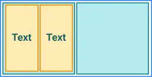
Nested-Flex-Box

Case 2: 3-layer nesting structure with multiple flex directions

By adding a flex-direction: column in the first case, you can change the layout of the 3rd layer containers like in the illustration below. In this case, you don't need to change the flex-basis value. In the first case, it worked as the width property. In this case, it works as the height property by changing the flex-direction property setting. This is the key benefit of using flex-basis instead of using width or height.
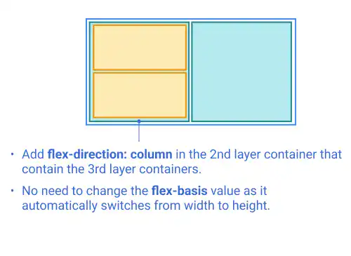
Nested-Flex-Box

Case 3: 4-layer nesting structure

You can further add another layer to create a 4-layer nesting structure.
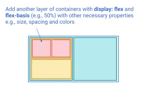
Nested-Flex-Box

Practice

Objective:
Practice creating various nested Flex Boxes

1. Update the body section of the HTML file

Add the code below in the <body> section of the chapter15.html file. We are adding new classes for the main container and nested containers. We are using the same basic properties for nested containers while customizing backgrounds, borders, content positions, and flex-direction directly in the HTML code using the style attribute.

chapter15.html
<h2>Nested Flex Box</h2>
<h3>Layout 1</h3>
<div class="flex-container-main">
  <div class="flex-container-nested" style="border: solid 2px green; background-color: lightcyan;">
    <div class="flex-container-nested" style="border: solid 2px orange; background-color: lightyellow;"></div>
    <div class="flex-container-nested" style="border: solid 2px orange; background-color: lightyellow;"></div>
  </div>
  <div class="flex-container-nested" style="border: solid 2px green; background-color: lightcyan"></div>
</div>

<h3>Layout 1 with Content in the Center</h3>
<div class="flex-container-main">
  <div class="flex-container-nested" style="border: solid 2px green; background-color: lightcyan;">
    <div class="flex-container-nested" style="border: solid 2px orange; background-color: lightyellow;align-items: center;justify-content: center;">Content</div>
    <div class="flex-container-nested" style="border: solid 2px orange; background-color: lightyellow;align-items: center;justify-content: center;">Content</div>
  </div>
  <div class="flex-container-nested" style="border: solid 2px green; background-color: lightcyan"></div>
</div>

<h3>Layout 2</h3>
<div class="flex-container-main">
  <div class="flex-container-nested" style="flex-direction: column; border: solid 2px green; background-color: lightcyan;">
    <div class="flex-container-nested" style="border: solid 2px orange; background-color: lightyellow;"></div>
    <div class="flex-container-nested" style="border: solid 2px orange; background-color: lightyellow;"></div>
  </div>
  <div class="flex-container-nested" style="border: solid 2px green; background-color: lightcyan"></div>
</div>

<h3>Layout 3</h3>
<div class="flex-container-main">
  <div class="flex-container-nested" style="flex-direction: column; border: solid 2px green; background-color: lightcyan;">
    <div class="flex-container-nested" style="border: solid 2px orange; background-color: lightyellow;">
      <div class="flex-container-nested" style="border: solid 2px lightcoral; background-color: pink;"></div>
      <div class="flex-container-nested" style="border: solid 2px lightcoral; background-color: pink;"></div>
    </div>
    <div class="flex-container-nested" style="border: solid 2px orange; background-color: lightyellow;"></div>
  </div>
  <div class="flex-container-nested" style="border: solid 2px green; background-color: lightcyan"></div>
</div>

2. Update the CSS file

Open the practice.css file and add new code for adding styles to the flex containers.

practice.css
.flex-container-main{
  display: flex;
  border: solid blue 2px;
  background-color: lightblue;
  padding: 3px;
  margin: 10px;
  width: 300px;
  height: 150px;
}

.flex-container-nested{
  display: flex;
  margin: 5px;
  flex-basis: 50%;
}

3. Check the result with a browser

  • Open chapter15.html with a browser.
  • You can see different types of nested Flex Boxes are created.

You can also check the sample result here (Demo Site link).

link demo code

Tag: