Chapter 9. Web Design Basics

Length

Length
Tag:

The length refers to the size of elements in HTML and CSS. There are many ways to set lengths. In this section, we'll explain six key lengths which are frequently used in CSS. We'll explain sizing-related CSS properties in more detail in the next chapter.

px

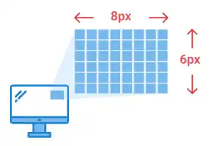
px (pixel) is used to define the length of elements in absolute pixel size. px is not dependent on the root element (HTML element), the parent element, or the viewport size; px can be useful when you want to fix the size of elements regardless of the browser's viewport size.
Length

em

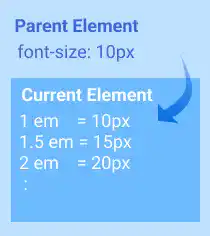
em defines the length of elements relative to the font size of the parent element. em is usually used to define font size. When the parent's font size changes, the font size defined in em will change proportionally. Due to this dependency, em is used in the specific design element that you want to keep in proportion to the parent element. For usual cases, rem is more commonly used for font size settings.
Length

rem

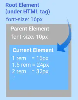
rem defines the length relative to the font size of the root html element. rem is usually used to define font size. As rem is independent of the parent element, managing font size with rem can be simpler than managing font size with em because rem does not require creating many font size variations in the same HTML document. Thus, rem is preferred for font size setting.
Length

%

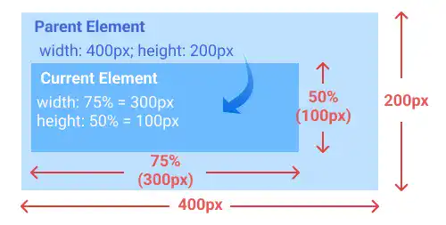
% is used to define the length of elements relative to the parent element. % is often used for layout sizing.
Length

vw and vh

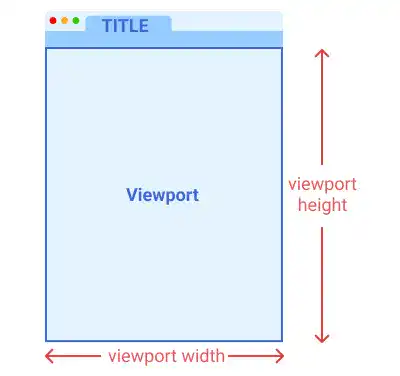
vw (view width) and vh (view height) are used to define the length of elements relative to the browser's viewport size. Viewport is the area where a browser renders web content like shown in the illustration below.
Length

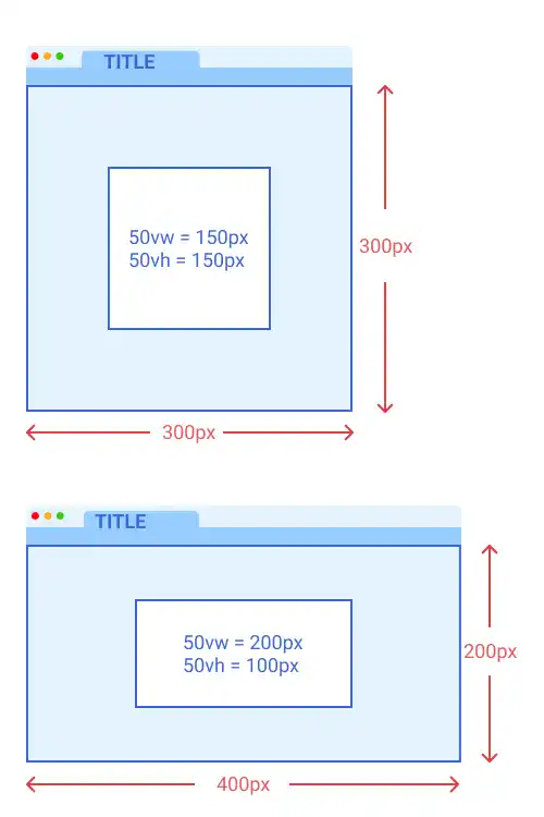
100vw and 100vh are the same size as the browser's viewport size. 50vw or 50vh is 50% of the viewport width or viewport height respectively. As the sizes defined by vw or vh dynamically change depending on viewport size, vw and vh are used for responsive design.
Length

The length refers to the size of elements in HTML and CSS. There are many ways to set lengths. In this section, we'll explain six key lengths which are frequently used in CSS. We'll explain sizing-related CSS properties in more detail in the next chapter.

px

px (pixel) is used to define the length of elements in absolute pixel size. px is not dependent on the root element (HTML element), the parent element, or the viewport size; px can be useful when you want to fix the size of elements regardless of the browser's viewport size.

Length

em

em defines the length of elements relative to the font size of the parent element. em is usually used to define font size. When the parent's font size changes, the font size defined in em will change proportionally. Due to this dependency, em is used in the specific design element that you want to keep in proportion to the parent element. For usual cases, rem is more commonly used for font size settings.

Length

rem

rem defines the length relative to the font size of the root html element. rem is usually used to define font size. As rem is independent of the parent element, managing font size with rem can be simpler than managing font size with em because rem does not require creating many font size variations in the same HTML document. Thus, rem is preferred for font size setting.

Length

%

% is used to define the length of elements relative to the parent element. % is often used for layout sizing.

Length

vw and vh

vw (view width) and vh (view height) are used to define the length of elements relative to the browser's viewport size. Viewport is the area where a browser renders web content like shown in the illustration below.

Length

100vw and 100vh are the same size as the browser's viewport size. 50vw or 50vh is 50% of the viewport width or viewport height respectively. As the sizes defined by vw or vh dynamically change depending on viewport size, vw and vh are used for responsive design.

Length

Tag: