Chapter 15. CSS: Layout – Flex Box

Align-items

Align-items
Tag:

The align-items property is used to set a layout pattern of flex items (nested child elements) along the cross axis of the flex container. The cross axis is typically the vertical axis unless you set column or column-reverse in the flex-direction property. We'll provide our explanation based on the default flex-direction setting.

This property is effective when the flex items are placed only in one line. When the flex items are wrapped, you need to add the align-content property, which will be explained in the next topic.

flex-start

This is the default setting. With this property value, flex items are laid out at the top edge of the parent element.

Note: 'edge' means the endpoint with some distance from the edge of the element based on the container's paddings and flex item's margins.
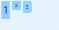
align-items

center

With this property value, flex items are laid out in the center of the parent element.
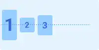
align-items

flex-end

With this property value, flex items are pushed out to the bottom edge of the parent element.
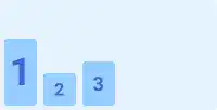
align-items

stretch

With this property value, flex items are stretched from the top edge to the bottom edge of the parent element.
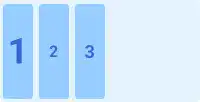
align-items

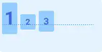
baseline

With this property value, flex items are aligned with the flex container baseline like in the image below.
align-items

Practice

Objective:
Check how the align-items property works

1. Update the body section of the HTML file

Add the code below in the <body> section of the chapter15.html file. We use the same classes as the ones set before. There is no need to set new classes.

chapter15.html
<h2>align-items</h2>
<h3>Original Position</h3>
<div class="flex-container" style="display: flex; height: 100px;">
  <div class="flex-item" style="font-size: 2rem;">1</div>
  <div class="flex-item">2</div>
  <div class="flex-item" style="font-size:1.5rem;">3</div>
</div>

<h3>align-items: flex-start</h3>
<div class="flex-container" style="display: flex; height: 100px; align-items: flex-start;">
  <div class="flex-item" style="font-size: 2rem;">1</div>
  <div class="flex-item">2</div>
  <div class="flex-item" style="font-size:1.5rem;">3</div>
</div>

<h3>align-items: center</h3>
<div class="flex-container" style="display: flex; height: 100px; align-items: center;">
  <div class="flex-item" style="font-size: 2rem;">1</div>
  <div class="flex-item">2</div>
  <div class="flex-item" style="font-size:1.5rem;">3</div>
</div>

<h3>align-items: flex-end</h3>
<div class="flex-container" style="display: flex; height: 100px; align-items: flex-end;">
  <div class="flex-item" style="font-size: 2rem;">1</div>
  <div class="flex-item">2</div>
  <div class="flex-item" style="font-size:1.5rem;">3</div>
</div>

<h3>align-items: stretch</h3>
<div class="flex-container" style="display: flex; height: 100px; align-items: space-between;">
  <div class="flex-item" style="font-size: 2rem;">1</div>
  <div class="flex-item">2</div>
  <div class="flex-item" style="font-size:1.5rem;">3</div>
</div>

<h3>align-items: baseline</h3>
<div class="flex-container" style="display: flex; height: 100px; align-items: baseline;">
  <div class="flex-item" style="font-size: 2rem;">1</div>
  <div class="flex-item">2</div>
  <div class="flex-item" style="font-size:1.5rem;">3</div>
</div>
<hr>

2. Check the result with a browser

  • Open chapter15.html with a browser.
  • You can see how the align-items property adjusts the positions of the flex items.

You can also check the sample result here (Demo Site link).

link demo code

Tag: