Chapter 15. CSS: Layout – Flex Box

Flex-shrink

Flex-shrink
Tag:

The flex-shrink property is used for shrinking the flex items to align with the flex container size when the combined size of flex items exceeds the flex container size. The shrinking direction defined by this property is the main axis direction. We'll provide our explanation based on the default flex-direction setting.

The value set in each flex item becomes the ratio of each flex item's contribution to shrink. For example, if there is an overflow part of 60px, this 60px is distributed to each item based on the ratio set for each flex item.

Original Status Example

flex-shrink

Case 1: Shrink evenly

If you set flex-shrink: 1 for all flex items, each item shrinks evenly to align with the flex container size.
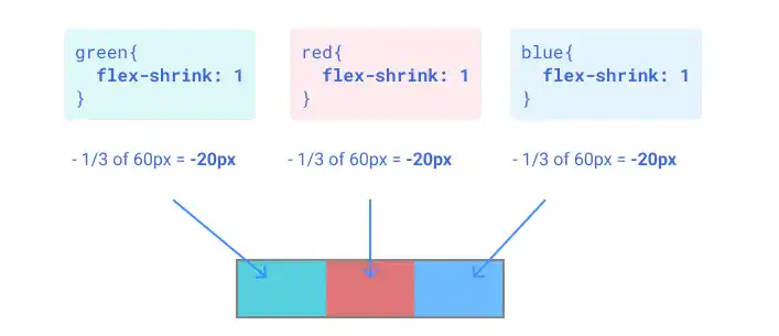
flex-shrink

Case 2: Shrink red and blue evenly

If you set flex-shrink: 1 for the red and blue items while flex-shrink: 0 for the green item, the red and blue items shrink evenly.
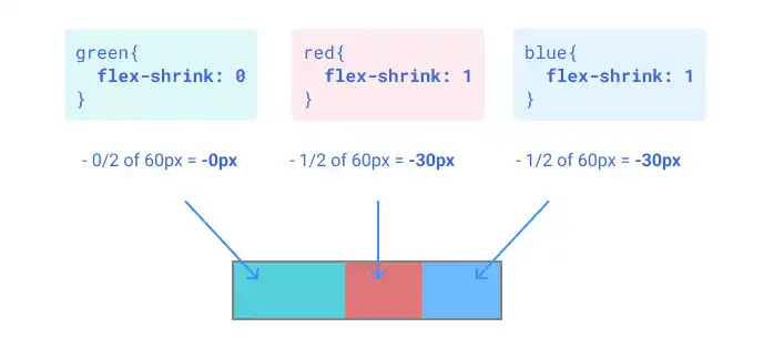
flex-shrink

Case 3: Shrink red and blue with a 1:2 ratio

If you set flex-shrink: 0 for green, 1 for red, and 2 for blue, the red and blue items shrink at a 1:2 ratio respectively.
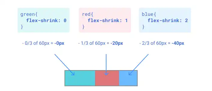
flex-shrink

Case 4: Grow blue only

If you set flex-grow: 1 for the blue item while flex-grow: 0 for the other two, only the blue item shrinks to align with the flex container size.
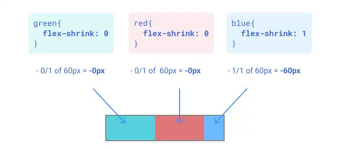
flex-shrink

IdeaDefault value and exception for flex-shrink

As the default value of the flex-shrink is 1, the total size of flex items is already aligned with the flex container size by default. Also, if the flexbox has content that cannot shrink — such as long text, this property won't work properly.

Practice

Objective:
Check how the flex-shrink property works

1. Update the body section of the HTML file

Add the code below in the <body> section of the chapter15.html file. We are adding new classes for the flex container and flex items. For the flex items, we are using different classes for each color: flex-item-to-shrink-1, flex-item-to-shrink-2, and flex-item-to-shrink-3.

As the flex-shrink property default value is 1, set flex-shrink: 0 for the first case to show clear contrasts with other cases.

chapter15.html
<h2>flex-shrink</h2>
<h3>Flex Item Size with No Shrink</h3>
<div class="flex-container-no-padding">
  <div class="flex-item-to-shrink-1" style="flex-shrink: 0;"></div>
  <div class="flex-item-to-shrink-2" style="flex-shrink: 0;"></div>
  <div class="flex-item-to-shrink-3" style="flex-shrink: 0;"></div>
</div>

<h3>Shrink Evenly</h3>
<div class="flex-container-no-padding">
  <div class="flex-item-to-shrink-1" style="flex-shrink: 1;">flex-shrink: 1</div>
  <div class="flex-item-to-shrink-2" style="flex-shrink: 1;">flex-shrink: 1</div>
  <div class="flex-item-to-shrink-3" style="flex-shrink: 1;">flex-shrink: 1</div>
</div>

<h3>Shrink Red and Blue with the Same Ratio</h3>
<div class="flex-container-no-padding">
  <div class="flex-item-to-shrink-1" style="flex-shrink: 0;">flex-shrink: 0</div>
  <div class="flex-item-to-shrink-2" style="flex-shrink: 1;">flex-shrink: 1</div>
  <div class="flex-item-to-shrink-3" style="flex-shrink: 1;">flex-shrink: 1</div>
</div>

<h3>Shrink Red and Blue with 1:2 Ratio</h3>
<div class="flex-container-no-padding">
  <div class="flex-item-to-shrink-1" style="flex-shrink: 0;">flex-shrink: 0</div>
  <div class="flex-item-to-shrink-2" style="flex-shrink: 1;">flex-shrink: 1</div>
  <div class="flex-item-to-shrink-3" style="flex-shrink: 2;">flex-shrink: 2</div>
</div>

<h3>Shrink Blue Only</h3>
<div class="flex-container-no-padding">
  <div class="flex-item-to-shrink-1" style="flex-shrink: 0;">flex-shrink: 0</div>
  <div class="flex-item-to-shrink-2" style="flex-shrink: 0;">flex-shrink: 0</div>
  <div class="flex-item-to-shrink-3" style="flex-shrink: 1;">flex-shrink: 1</div>
</div>
<hr>

2. Update the CSS file

Open the practice.css file and add new code for adding styles to the flex items. As we set a 300px width for the container, we also need to set a 120px width for the flex items to create the situation where the total width of flex items exceeds the flex container size (additional 60px).

practice.css
.flex-item-to-shrink-1{
  padding: 5px;
  background-color: green;
  color: white;
  text-align: center;
  box-sizing: border-box;
  height: 100px;
  width: 120px;
}

.flex-item-to-shrink-2{
  padding: 5px;
  background-color: red;
  color: white;
  text-align: center;
  box-sizing: border-box;
  height: 100px;
  width: 120px;
}

.flex-item-to-shrink-3{
  padding: 5px;
  background-color: blue;
  color: white;
  text-align: center;
  box-sizing: border-box;
  height: 100px;
  width: 120px;
}

3. Check the result with a browser

  • Open chapter15.html with a browser.
  • You can see how the flex-shrink property adjusts the size of each flex item.

You can also check the sample result here (Demo Site link).

link demo code

Tag: