Home (Landing) Page Development

The home page sometimes refers to the entire website, but it is usually defined as the first page in the website hierarchy. The index.html file is usually used for the home page. As the home page is the page users first land when reaching the website, it is also called a landing page, but 'landing page' can be used in a wider context, such as the first page of a web campaign page. On a home page or landing page, usually, a large cover image is often used to attract website users. There are particular CSS techniques to style this type of page.
In this lesson, we'll use an example with the design structure in the main figure: a two-column structure on a desktop/laptop and a single-column structure on a mobile device. A website design that can change its layout automatically depending on screen size is called responsive design. There are several techniques to implement responsive design and we'll cover them in the next course in detail. In this lesson, we'll use a simple implementation example with the Flex Box layout.
The images below are the target design of the home page example.
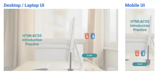
We'll explain how to implement the target design of a home page using the following three steps.
- Sectioning
- Component position alignment
- Background cover image adjustment
1. Sectioning
First, we divide the screen into two sections horizontally at a 50:50 ratio. Then, further divide the second section into two sub-sections vertically at a 50:50 ratio.
This is the sectioning illustration for the desktop/laptop view.
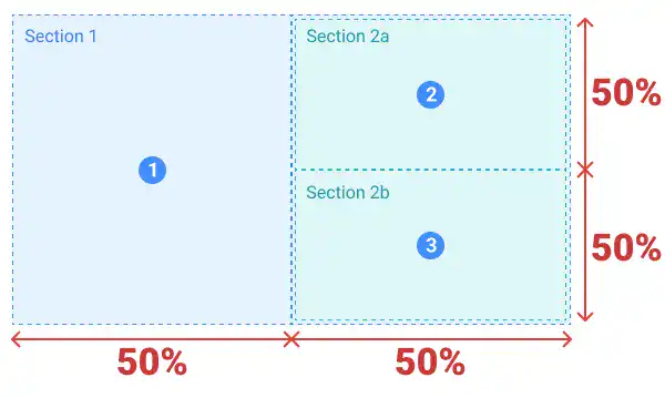
For the mobile UI, we expect the sectioning like in the image below. The second section moves under the first section depending on the width of the browser.
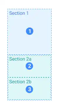
Using the Flex Box layout, you can implement this structure easily.
- Create a set of nested flex containers and set
flex-basis: 50%for the child and grandchild flex containers. - To make a responsive design, set
flex-wrap: wrapfor the parent container. - To change the layout direction, set
flex-direction: columnfor the second container.
To see the example code, check the practice section.
2. Component position alignment
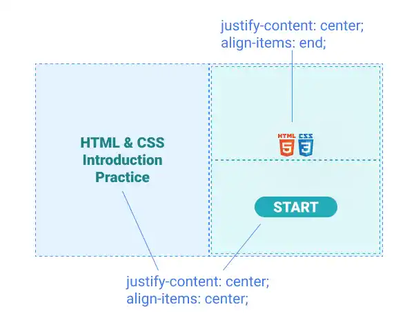
After defining sections, you can set the positions of each sub-element in each section.
For the first section, set justify-content: center and align-items: center for the parent container. Also, set align-text: center to adjust the wrapped text position.
For the second and third sections, you can set the same properties but adjust the logo positions overriding the align-items property by directly setting align-items: end for the specific element using the inline style sheet approach.
3. Background cover image adjustment
Lastly, you can set a background image. As you don't want a background image to disturb other design elements, you can add a translucent layer to make the background image blur like in the illustration below.
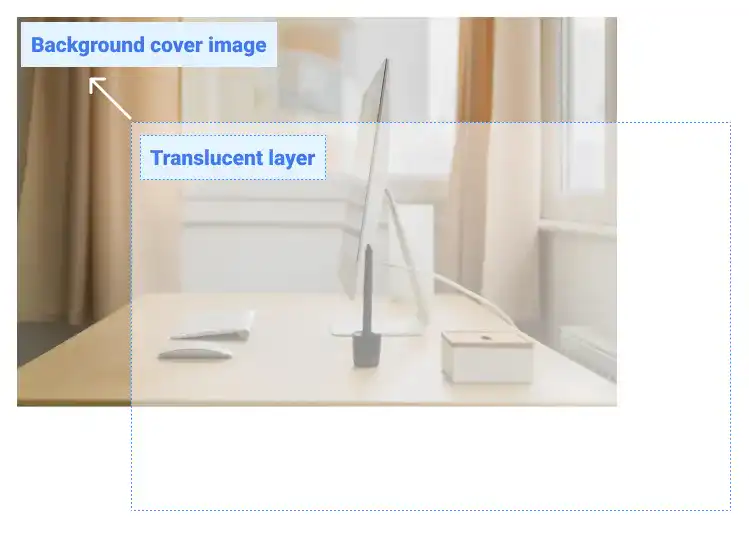
First, setting the background image size to fit the browser size is important. As we don't want to make a shaky design in the mobile UI due to an image size that is larger than the browser viewport, set the image size properly. This is an example of CSS code to set the background image.
With this code, the home-bg.png image will be placed:
- in the center horizontally
- at the top of the page and will cover the entire page
- with the same height as the browser viewport
body{
  background: url(img/home-bg.png) no-repeat center top/cover;
  height: 100vh;
  width: 100%;
  margin: 0;
  padding: 0;
  box-sizing: border-box;
}
margin: 0, padding: 0, and box-sizing: border-box are used to make sure the background image fits the browser size.
To avoid setting the same background image for other pages, you can set this property under the head section of a specific HTML file.
For the translucent layer, you can use the parent flex container set in the first step. This is an example of the CSS code for setting the translucent layer. Use the same sizes as for the body element.
.flex-container-home{
  :
  background-color: rgba(255,255,255,0.5);
  height: 100vh;
  margin: 0;
  padding: 0;
}
Practice
Objective:
Create and style a responsive web page with a large cover image
1. Prepare an image file
For this practice, first, we prepare a cover image. You can get an image from free image download services. Check Tips: Preparing Image Files.
2. Create a new HTML file for the home page
- Create a copy of the chapter17.html file and change the name to index.html.
- Change the
<title>section to HTML & CSS Introduction Practice. - Also, delete the existing content of the
<body>element that was created in the previous chapter. - The code should look like the one below.
<!DOCTYPE html>
<html lang="en">
  <head>
    <meta charset="UTF-8">
    <meta name="viewport" content="width=device-width, initial-scale=1.0">
    <!--Google Font-->
    <link rel="preconnect" href="https://fonts.googleapis.com">
    <link rel="preconnect" href="https://fonts.gstatic.com" crossorigin>
    <link href="https://fonts.googleapis.com/css2?family=Roboto:ital,wght@0,100;0,300;0,400;0,500;0,700;0,900;1,100;1,300;1,400;1,500;1,700;1,900&display=swap" rel="stylesheet">
    <!--Custom CSS-->
    <link rel="stylesheet" href="css/practice.css">
    <link rel="stylesheet" href="css/component.css">
    <title>HTML & CSS Introduction Practice</title>
  </head>
  <body>

  </body>
</html>
3. Update the body section
Add the code below in the <body> section of the HTML file.
<body>
  <div class="flex-container-home">
    <div class="flex-container-home-nested">
      <h1 style="max-width: 300px;font-size: 3rem; text-align: center; color: #2197A2">HTML&CSS Introduction Practice</h1>
    </div>
    <div class="flex-container-home-nested" style="flex-direction: column;">
      <div class="flex-container-home-nested" style="align-items: end;">
        <img src="img/html5.png" style="width: auto; height: 80px; margin: 10px;">
        <img src="img/css3.png" style="width: auto; height: 80px; margin:10px">
      </div>
      <div class="flex-container-home-nested">
        <a href="main-page.html" class="btn-flex">START</a>
      </div>
    </div>
  </div>
</body>
4. Add CSS code in the head section of the HTML file
As the CSS code is only used for this page, use the head section of the HTML file with the <style> tag. With this approach, you can avoid setting the same background image for other pages.
<style>
  body{
    background: url(img/home-bg.png) no-repeat center top/cover;
    height: 100vh;
    margin: 0;
    padding: 0;
    box-sizing: border-box;
  }

  .flex-container-home{
    display: flex;
    flex-wrap: wrap;
    justify-content: center;
    background-color: rgba(255,255,255,0.5);
    height: 100vh;
    margin: 0;
    padding: 0;
  }

  .flex-container-home-nested{
    display: flex;
    flex-basis: 50%;
    justify-content: center;
    align-items: center;
  }
</style>
5. Check the result with a browser using Live Server
Click on the Go Live button at the bottom of VS Code. Your browser will open the home page. Change the browser size horizontally so that you can confirm that the responsive design is implemented properly.
You can also check the sample result here (Demo Site).


