font-size

The font-size property is used to set the size of fonts. You can use various length units or keywords to set a property value.
px, em, rem
px, em, and rem are often used as font-size units.
px (pixel) is the length unit used to define the size of elements in absolute pixel size. px is useful when you want to fix the size of elements regardless of the browser's viewport size.
em defines the length of elements relative to the parent element's font-size. em is used in the specific design element that you want to keep proportional to the parent element.
rem defines the size relative to the root html element's font-size. rem is usually used to define font size. If you have many nesting elements in your website design, using rem makes managing different sizes easier as it won't impact the parent element's font size. If you use em in a website with multi-layer nesting elements, managing font sizes can be very complicated. Thus, rem is often preferred for font size settings.
Inheritance
Each element inherits its parent font size, which means the font-size set for the body element is usually applied to descendant elements. However, there are some elements that have different font sizes as a default, such as headings. This is because each browser has its default stylesheets, called user-agent stylesheets, and the stylesheets have different font sizes for particular elements.
 62.5%
62.5%
As the default font size of the root element (<html> element) is usually 16px, adjusting the font size of the <html> element to 62.5%, which is equal to 10px, is often used as a technique. This makes it easier for us to use rem sizing in a more intuitive way. For example, 1rem becomes 10px, 1.6rem becomes 16px or 2rem becomes 20px.
To maintain the normal font size setting the same as the default setting, you can set the body font size to 1.6rem. By doing this, you can maintain the default font size while adjusting the font size to 1rem.
Here is the CSS code often applied to the <html> and <body> elements at the beginning of a project.
html{
  font-size: 62.5%;
}

body{
  font-size: 1.6rem;
}
Heading Font Size
The default font size of the root element (<html>) is 16px in most browsers. As explained, each element inherits the font size, however, some elements, such as heading elements, have different default settings.
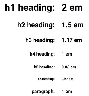
In most browsers, headings' default font sizes are defined by the em unit and differ by level. The <h1> is the largest while <h6> is the smallest. The <h4> and <p> have the same font size.
This is the summary of the heading tag and paragraph tag's default font size setting.

Practice 1
Objective:
Check the default headings' font sizes
1. Create a new HTML file for this chapter
- Create a copy of the chapter10.html file and change the name to chapter11.html.
- Change the
<title>section to 11. CSS: Styling Text and Images. - Also, delete the existing content of the
<body>element that was created in the previous chapter. - Add the
<h1>tag to show the chapter title of this page at the top of the page. - The code should look like the one below.
<!DOCTYPE html>
<html lang="en">
<head>
  <meta charset="UTF-8">
  <meta name="viewport" content="width=device-width, initial-scale=1.0">
  <link rel="stylesheet" href="css/practice.css">
  <title>Chapter 11. CSS: Styling Text and Images</title>
</head>
<body>
  <h1>Chapter 11. CSS: Styling Text and Images</h1>
</body>
</html>
2. Update the body section
Add the code below in the body section of the HTML file. We are adding the font-size-box class to add a group for adding the font-size styling.
<h2>Font Size</h2>
<h3>Font Size Original</h3>
  <div class="font-size-box">
  <h1>h1 Font Size</h1>
  <h2>h2 Font Size</h2>
  <h3>h3 Font Size</h3>
  <h4>h4 Font Size</h4>
  <h5>h5 Font Size</h5>
  <h6>h6 Font Size</h6>
<p>Paragraph Font Size</p>
</div>
3. Update the CSS file
Open the practice.css file and add new code to add styles to the font-size-box class. We haven't explained the border properties yet. For now, just copy and paste the code to your file. For better code readability, add a comment upfront.
/* Chapter 11. CSS: Styling Text and Images */
.font-size-box{
  width: 300px;
  padding: 5px;
  border:1px dotted #26BCCE;
}
4. Check the result with a browser
- Open chapter11.html with a browser
- You can see how headings are displayed as default settings.
You can also check the sample result here (Demo Site).
Practice 2
Objective:
Check how the parent font size impacts heading font sizes
1. Update the body section of the HTML file
Add the code below to the chapter11.html file. In this code, we are changing the parent element font size to 10px.
<h3>Font Size: Parent Font Size 10px (Child Font Size Original)</h3>
<div class="font-size-box" style="font-size: 10px;">
  <h1>h1 Font Size</h1>
  <h2>h2 Font Size</h2>
  <h3>h3 Font Size</h3>
  <h4>h4 Font Size</h4>
  <h5>h5 Font Size</h5>
  <h6>h6 Font Size</h6>
  <p>Paragraph Font Size</p>
</div>
2. Check the result with a browser
- Open chapter11.html with a browser.
- You can see how each heading's font size changes.
You can also check the sample result here (Demo Site).
Practice 3
Objective:
Check how each length (size) unit behaves differently.
1. Update the body section
Add the code below to the chapter11.html file. In this code, we are changing the <h1> element's font size using different length units.
<h3>Font Size: Parent Font Size 10px (Child Font Size with Different Unit)</h3>
<div class="font-size-box" style="font-size: 10px;">
  <h1>h1 Font Size: No Setting</h1>
  <h1 style="font-size: 2em">h1 Font Size: 2em</h1>
  <h1 style="font-size: 200%">h1 Font Size: 200%</h1>
  <h1 style="font-size: 20px">h1 Font Size: 20px</h1>
  <h1 style="font-size: 2rem">h1 Font Size: 2 rem</h1>
</div>
<hr>
2. Check the result with a browser
- Open chapter11.html with a browser
- You can confirm several points:
<h1>default font size setting is2em.200%is the same as2em(proportion to the parent element).20pxis the same as2em(as the parent font size is10pxnow).remdoesn't follow the parent font size change.
You can also check the sample result here (Demo Site).


