flex-grow

The flex-grow property is used for filling the flex container's remaining space with the flex items. The growing direction defined by this property is the main axis direction. We'll provide our explanation based on the default flex-direction setting.
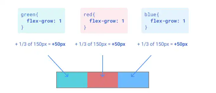
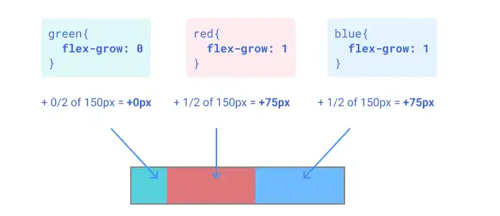
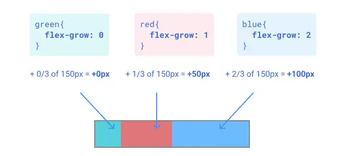
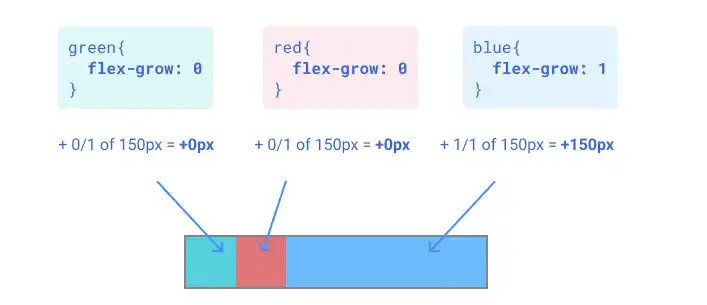
The value set for each flex item becomes the ratio of each flex item's contribution to fill the remaining space. For example, if there is a remaining space of 150px, a portion of this 150px is distributed to each item based on the ratio set for each flex item. The default value 0 is applied to the flex item if you don't specify flex-grow for the flex item.
Original Status Example

Case 1: Grow evenly
If you set flex-grow: 1 for all flex items, each item grows evenly to fill the remaining space.

Case 2: Grow red and blue evenly
If you set flex-grow: 1 for the red and blue items while flex-grow: 0 for the green item, the red and blue items grow evenly to fill the remaining space.

Case 3: Grow red and blue with a 1:2 ratio
If you set flex-grow: 0 for green, 1 for red, and 2 for blue, the red and blue items grow at a 1:2 ratio respectively.

Case 4: Grow blue only
If you set flex-grow: 1 for the blue item while flex-grow: 0 for the other two, only the blue item grows to fill the remaining space.

Practice
Objective:
Check how the flex-grow property works
1. Update the body section of the HTML file
Add the code below in the <body> section of the chapter15.html file. We are adding new classes for the flex container and flex items. For the flex items, we are using different classes for each color: flex-item-to-grow-1, flex-item-to-grow-2, and flex-item-to-grow-3.
<h2>flex-grow</h2>
<h3>Original Flex Item Size</h3>
<div class="flex-container-no-padding">
  <div class="flex-item-to-grow-1"></div>
  <div class="flex-item-to-grow-2"></div>
  <div class="flex-item-to-grow-3"></div>
</div>

<h3>Grow Evenly</h3>
<div class="flex-container-no-padding">
  <div class="flex-item-to-grow-1" style="flex-grow: 1;">flex-grow: 1</div>
  <div class="flex-item-to-grow-2" style="flex-grow: 1;">flex-grow: 1</div>
  <div class="flex-item-to-grow-3" style="flex-grow: 1;">flex-grow: 1</div>
</div>

<h3>Grow Red and Blue with the Same Ratio</h3>
<div class="flex-container-no-padding">
  <div class="flex-item-to-grow-1" style="flex-grow: 0;">flex-grow: 0</div>
  <div class="flex-item-to-grow-2" style="flex-grow: 1;">flex-grow: 1</div>
  <div class="flex-item-to-grow-3" style="flex-grow: 1;">flex-grow: 1</div>
</div>

<h3>Grow Red and Blue with 1:2 Ratio</h3>
<div class="flex-container-no-padding">
  <div class="flex-item-to-grow-1" style="flex-grow: 0;">flex-grow: 0</div>
  <div class="flex-item-to-grow-2" style="flex-grow: 1;">flex-grow: 1</div>
  <div class="flex-item-to-grow-3" style="flex-grow: 2;">flex-grow: 2</div>
</div>

<h3>Grow Blue Only</h3>
<div class="flex-container-no-padding">
  <div class="flex-item-to-grow-1" style="flex-grow: 0;">flex-grow: 0</div>
  <div class="flex-item-to-grow-2" style="flex-grow: 0;">flex-grow: 0</div>
  <div class="flex-item-to-grow-3" style="flex-grow: 1;">flex-grow: 1</div>
</div>
<hr>
2. Update the CSS file
Open the practice.css file and add new code for adding styles to the flex container and flex items. Set 50px in width for the three flex items while setting 300px for the flex container to create room for growth (remaining 150px).
.flex-container-no-padding{
  border: solid #23ACBB;
  display: flex;
  height: 100px;
  width: 300px;
  margin:10px;
}

.flex-item-to-grow-1{
  padding: 5px;
  background-color: green;
  color: white;
  text-align: center;
  box-sizing: border-box;
  height: 100px;
  width: 50px;
}

.flex-item-to-grow-2{
  padding: 5px;
  background-color: red;
  color: white;
  text-align: center;
  box-sizing: border-box;
  height: 100px;
  width: 50px;
}

.flex-item-to-grow-3{
  padding: 5px;
  background-color: blue;
  color: white;
  text-align: center;
  box-sizing: border-box;
  height: 100px;
  width: 50px;
}
3. Check the result with a browser
- Open chapter15.html with a browser.
- You can see how the
flex-growproperty adjusts the size of each flex item.
You can also check the sample result here (Demo Site).


