Django Allauth (9) – Customize Sign-in and Sign-up Pages

The last part of the social login UI styling adjustment is for the Sign In (login) and Sign Up page. Currently, the social login UI design is just simple text, and social login is only available on the Sign In (login) page. In this section, we'll restructure the pages and add logos.
Add logos
As the links to the social login (e.g., GitHub and Google) are coming from the allauth source code, you may have difficulty replacing text links with image links. Here are the steps to add images to the social login links.
Prepare icons
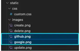
We use these Google and GitHub icons for the links. To make them accessible by Django, save these image files under the images directory.

Define HTML elements to add icons
First, you need to identify the elements where you want to add the icons. This part may be the most challenging part.
To see where the GitHub's and Google's texts come from, check the account/login.html file. You can see that this HTML document includes another HTML document – socialaccount/snippets/provider_list.html.
{% if socialaccount_providers %}
<p>{% blocktrans with site.name as site_name %}Please sign in with one
of your existing third party accounts. Or, <a href="{{ signup_url }}">sign up</a>
for a {{ site_name }} account and sign in below:{% endblocktrans %}</p>

<div class="socialaccount_ballot">

  <ul class="socialaccount_providers">
  {% include "socialaccount/snippets/provider_list.html" with process="login" %}
  </ul>

  <div class="login-or">{% trans 'or' %}</div>

</div>

{% include "socialaccount/snippets/login_extra.html" %}

{% else %}
<p>{% blocktrans %}If you have not created an account yet, then please
<a href="{{ signup_url }}">sign up</a> first.{% endblocktrans %}</p>
{% endif %}
Check the socialaccount/snippets/provider_list.html file to identify the location where the text data is coming from.
{% load socialaccount %}
{% get_providers as socialaccount_providers %}

{% for provider in socialaccount_providers %}
{% if provider.id == "openid" %}
{% for brand in provider.get_brands %}
<li>
  <a title="{{brand.name}}" class="socialaccount_provider {{provider.id}} {{brand.id}}" href="{% provider_login_url provider.id openid=brand.openid_url process=process %}">{{brand.name}}</a>
</li>
{% endfor %}
{% endif %}
<li>
  <a title="{{provider.name}}" class="socialaccount_provider {{provider.id}}" href="{% provider_login_url provider.id process=process scope=scope auth_params=auth_params %}">{{provider.name}}</a>
</li>
{% endfor %}
The text data comes from {{brand.name}} or {{provider.name}}. We found the location of the HTML code; however, we cannot add links to the images as {{brand.name}} and {{provider.name}} are variables.
To find more information, go to the browser and select "inspect" with a right-click.
Now, you can see the actual code implemented in a browser. The GitHub and Google elements have their own classes – github and google. We can utilize these class names to identify the location of the elements where we want to add images.

Add images to the elements
We can utilize the custom.css file to add images. In this example, we'll use the background-image property to show the icons. The path is the relative path from the CSS file to the image file. As this file is not a Django template, you don't need to use the {% url %} tag. Add several properties to adequately adjust the size of the icons.
.github {
  display: inline-block;
  content: '';
  width: 50px;
  height: 50px;
  background-image: url("../images/github.png");
  background-size: contain;
}
.google {
  display: inline-block;
  content: '';
  width: 50px;
  height: 50px;
  background-image: url("../images/google.png");
  background-size: contain;
}
At this point, the icons are overlapping with the text. Also, there are list markers, and the icons are vertically listed.
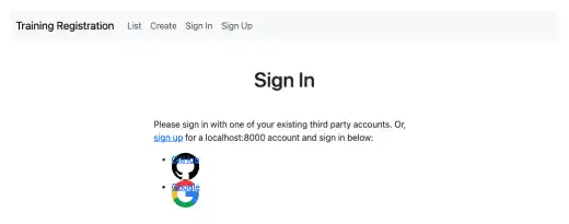
To fix the page, edit socialaccount/snippets/provider_list.html by doing the following:
- Add
d-flexto arrange the icons horizontally - Delete the markers using the
list-style-typeproperty - Delete {{provider.name}}
{% load socialaccount %}
{% get_providers as socialaccount_providers %}
<div class="d-flex justify-content-center gap-3">
  {% for provider in socialaccount_providers %}
  {% if provider.id == "openid" %}
  {% for brand in provider.get_brands %}
  <li>
    <a title="{{brand.name}}"
class="socialaccount_provider {{provider.id}} {{brand.id}}"
href="{% provider_login_url provider.id openid=brand.openid_url process=process %}"
>{{brand.name}}</a>
  </li>
  {% endfor %}
  {% endif %}
  <li style="list-style-type: none;">
    <a title="{{provider.name}}" class="socialaccount_provider {{provider.id}}"
href="{% provider_login_url provider.id process=process scope=scope auth_params=auth_params %}">###delete###</a>
  </li>
  {% endfor %}
</div>
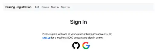
Now you can see a better design.
Adjust the layout of the Sign In and Sign Up pages
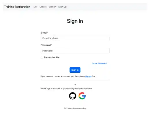
Typically, social login comes after the standard login approach. Also, social login should be available on the Sign Up page as well. In this part, we'll skip the detailed explanations as several minor adjustments are needed. Here are the high-level guidance and results.
Sign In page
Make the following adjustments:
- Move up the standard login code before the social login code
- Move the Forgot Password link to the right
- Move the sign up link after the Sign In button
- Add a horizontal line after the sign up link
- Simplify the message for the social login
- Adjust font sizes
Now you can see a much cleaner Sign In page.
Sign Up page
Make the following adjustments:
- Bring a social login code from the Sign In page
- Add the
{% load account socialaccount %}tag to make the social login code function - Adjust font sizes
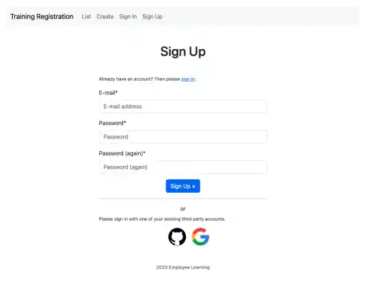
Now you can see a much cleaner Sign Up page.
