border-radius

The border-radius property is used for setting round-shaped corners. You can use the border-radius without setting border-style. When the element's background is not transparent, you can still see the round corners even though the border style is not defined.
Property Values
Usually, px or % are used for border-radius although you can use other length units.
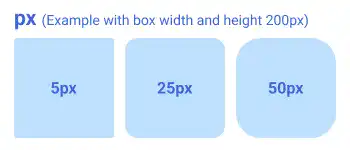
px
Using px, you can specify a fixed radius size independent of the element size. This is useful when you want to keep the same radius for all boxes regardless of the box size.
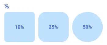
%
Using %, you can specify a radius size relative to the element size. If you set 50% for all corners, the box becomes a complete circle.
Multiple Values
Like other border properties, you can set multiple values to set border-radius; however, the positions are different as border-radius adjusts the corner shapes (not borders).
When you set only one value, the radius size is applied to all corners. By setting multiple values, you can set different radius sizes for each corner of the element.
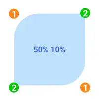
Two values
- The first value is applied to the top left and bottom right corners.
- The second value is applied to the top right and bottom left corners.
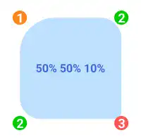
Three values
- The first value is applied to the top left corner.
- The second value is applied to the top right and bottom left corners.
- The third value is applied to the bottom right corner.
Four values
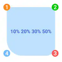
Using four values, you can specify the radius size of each corner. The property values are set based on clockwise order starting from the top left.
- The first value is applied to the top left corner.
- The second value is applied to the top right corner
- The third value is applied to the bottom right corner.
- The fourth value is applied to the bottom left corner.
Practice
Objective:
Practice to set different border radius width with different number of values
1. Update the body section of the HTML file
Add the code below in the body section of the chapter13.html file. We are adding the bg-border-radius class to set the size and shape of each box as a base object style. The code for the styling will be explained in the next step.
We also add border-radius to the base object using the style attribute for each element so that we can customize the border-radius style for each element. This part of the CSS code is written in the HTML file below.
In the code below, we are wrapping each set of item groups using the <div> element with the display and flex-wrap properties to structure the results. We'll explain these properties in detail later. For now, just copy and paste the code.
<h2>Border Radius</h2>
<div class="bg-border-radius">Original</div>
<h3>px</h3>
<div style="display: flex; flex-wrap: wrap;">
  <div class="bg-border-radius" style="border-radius: 5px;">5px</div>
  <div class="bg-border-radius" style="border-radius: 25px;">25px</div>
  <div class="bg-border-radius" style="border-radius: 50px;">50px</div>
</div>

<h3>%</h3>
<div style="display: flex; flex-wrap: wrap;">
  <div class="bg-border-radius" style="border-radius: 10%;">10%</div>
  <div class="bg-border-radius" style="border-radius: 25%;">25%</div>
  <div class="bg-border-radius" style="border-radius: 50%;">50%</div>
</div>

<h3>Multiple Values</h3>
<div style="display: flex; flex-wrap: wrap;">
  <div class="bg-border-radius" style="border-radius: 50% 10%;"><b>2 Values</b>: 50% 10%</div>
  <div class="bg-border-radius" style="border-radius: 50% 30% 10%;"><b>3 Values</b>: 50% 30% 10%</div>
  <div class="bg-border-radius" style="border-radius: 10% 20% 30% 50%;"><b>4 Values</b>: 10% 20% 30% 50%</div>
</div>
<hr>
2. Update the CSS file
Open the practice.css file and add new code for adding styles to the bg-border-radius class.
.bg-border-radius{
  width: 250px;
  height: 250px;
  margin: 10px;
  padding: 10px;
  background-color: #B3EBEF;
  text-align: center;
  line-height: 250px;
}
3. Check the result with a browser
- Open chapter13.html with a browser
- You can see how different sizes for the
border-radiusare set with multiple property values.
You can also check the sample result here (Demo Site).


