background-size

The background-size is used for setting the size of the background image. Using the property, you can avoid the problems explained in the previous topic.
Default value
The default value of the background-size property is auto which returns the original size of the image. You can check the size of the image in the file information. Below is an example of a user interface in Mac OS. You can check the image pixel size using Preview. When you double-click on the image file, you can see a preview of the image. There is an information icon on top. By pressing the icon, you can see the image's width and height. In this case, the image size is 6720x4480 pixels. 6720 is the width of the image and 4480 is the height of the image.

Lengths (sizes)
You can use several lengths. If you want to specify absolute sizes, you can use px. If you want to specify sizes relative to the parent element, you can use %. If you want to set a certain ratio of the browser window size you can use vw or vh. If you want to align the image size with font sizes, you can use rem or em.
When you specify both width and height, you need to specify width first. You can specify width or height only as well.
- When you want to specify
widthonly, you need just one value. - If you want to specify
heightonly and keep the same aspect ratio, typeautobefore theheightvalue.
Here are some examples:
Width and Height
background-size: 400px 300px;
Width only (height is automatically defined while keeping the same aspect ratio)
background-size: 400px;
Height only (width is automatically defined while keeping the same aspect ratio)
background-size: auto 400px;
 Aspect Ratio
Aspect Ratio is often used to define display screen size or image size. For example, 4:3 or 16:9 are frequently used aspect ratios. The first number defines width and the second number defines height.

Cover and Contain
For the background-size property, the keywords of cover and contain are often used.
cover
The cover keyword adjusts the background image size to cover the entire element that the background-size property is set for. When the element has both width and height values and its aspect ratio is different from the image's aspect ratio, a part of the image won't be displayed.
For example, if the image is vertically longer, the image width will be aligned with the width of the element while the bottom part of the image can be cut like in the example below. In this case, the result becomes the same as the result when you set 100% for the width of the background size.

If the image is horizontally longer, the image height will be aligned with the height of the element while the right part of the image can be cut like in the example below. In this case, the result becomes the same as the result when you set 100% for the height of the background size.
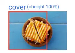
contain
The contain keyword adjusts the background image size to fully display the image. When the element has both width and height values and its aspect ratio is different from the image's aspect ratio, a blank space can be created, or repeated images can be shown.
Here are two examples when background-repeat: no-repeat is set for the element. (We'll explain the background-repeat property in the next topic.)
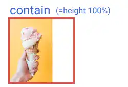
For example, if the image is vertically longer, the image height will be aligned with the height of the element while a blank space will appear on the right side like in the example below. In this case, the result becomes the same as the result when you set 100% for the height of the background size.
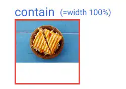
If the image is horizontally longer, the image width will be aligned with the width of the element while a blank space will appear at the bottom part like in the example below. In this case, the result becomes the same as the result when you set 100% for the width of the background size.
Practice 1
Objective:
Set a background image for the body element and adjust the image size
1. Prepare an image file
For this practice, we are using a photo from Unsplash. Find a monochrome color photo as it is used for the background. Save the file under the img directory under the project directory.
2. Update the CSS file
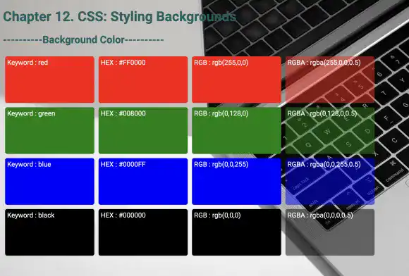
Open the practice.css file and add new code that allows to add the background-image and background-size properties to the body element. You can use any image you prepared. Set the background-size at 100vw, so that the image fits the width of the browser window.
body{
  background-color: white;
  color: #196060;
  font-family: roboto, sans-serif;
  background-image: url(../img/monotone_bg.jpg);
  background-size: 100vw;
}
3. Check the result with a browser
- Open chapter12.html with a browser.
- You can confirm that the background image is set properly.
4. Comment out the properties
As we don't want to keep the background image for the following practices, comment out the background-image and background-size properties.
body{
  background-color: white;
  color: #196060;
  font-family: roboto, sans-serif;
/* background-image: url(../img/monotone_bg.jpg); */
/* background-size: 100vw; */
}
Practice 2
Objective:
Set a background image for the elements with width and height
1. Update the body section of the HTML file
Add the code below at the end of the body section in the chapter12.html file. In this code, We add the bg-img-frame class to define the size of the image frame. We also set the bg-image-1 and bg-image-2 classes for two different background images.
In the code below, we are wrapping each set of frames using the <div> element with the display and flex-wrap properties to structure the results. We'll explain these properties in detail later. For now, just copy and paste the code.
<h2>Background Image without Size Setting</h2>
<div style="display: flex; flex-wrap: wrap;">
  <div class="bg-img-frame bg-image-1"><span style="vertical-align: bottom;"></span></div>
  <div class="bg-img-frame bg-image-2"><span style="vertical-align: bottom;"></span></div>
</div>
<hr>
<h2>Background Image and Size</h2>
<div style="display: flex; flex-wrap: wrap;">
  <div class="bg-img-frame bg-image-1" style="background-size: cover;">Cover</div>
  <div class="bg-img-frame bg-image-1" style="background-size: contain;">Contain</div>
  <div class="bg-img-frame bg-image-1" style="background-size: 100%;">Width 100%</div>
  <div class="bg-img-frame bg-image-1" style="background-size: auto 100%;">Height 100%</div>
  <div class="bg-img-frame bg-image-1" style="background-size: 50%;">Width 50%</div>
</div>

<div style="display: flex; flex-wrap: wrap;">
  <div class="bg-img-frame bg-image-2" style="background-size: cover;">Cover</div>
  <div class="bg-img-frame bg-image-2" style="background-size: contain;">Contain</div>
  <div class="bg-img-frame bg-image-2" style="background-size: 100%;">Width 100%</div>
  <div class="bg-img-frame bg-image-2" style="background-size: auto 100%;">Height 100%</div>
  <div class="bg-img-frame bg-image-2" style="background-size: auto 50%;">Height 50%</div>
</div>
<hr>
2. Prepare image files
We are using two images – one is a vertically long image and the other is a horizontally long image. Save the two image files under the img directory of the project.
3. Update the CSS file
Open the practice.css file and add the new code to add styles to the image frame (250x250 and other properties) and file paths of image files. We haven't explained some properties yet. For now, just copy and paste the code into your file.
.bg-img-frame{
  width: 250px;
  height: 250px;
  margin: 10px;
  padding: 10px;
  border:2px solid seagreen;
  background-repeat: no-repeat;
  box-sizing: border-box;
  font-weight: bold;
}

.bg-image-1{
  background-image:url(../img/icecream_400x600.png);
}

.bg-image-2{
  background-image:url(../img/sandwich_600x400.png);
}
4. Check the result with a browser
- Open chapter12.html with a browser.
- You can see how different image size settings work.
You can also check the sample result here (Demo Site).


