align-self

The align-self property is used for customizing the position of a specific flex item (a child element) along the cross axis of the flex container. The cross axis is typically the vertical axis unless you set column or column-reverse in the flex-direction property. We'll provide our explanation based on the default flex-direction setting.
Unlike other flex box-related properties, this property is set at a child element.
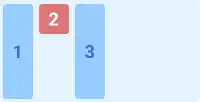
flex-start
With this property value, the selected flex item is positioned at the top edge of the parent element with its original size.
Note: 'edge' means the endpoint with some distance from the edge of the element based on the container's padding and flex item's margin.
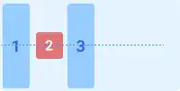
center
With this property value, the selected flex item is positioned in the center of the parent element with its original size.
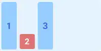
flex-end
With this property value, the selected flex item is positioned at the bottom edge of the parent element with its original size.
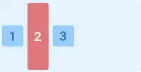
stretch
With this property value, the selected flex item is stretched from the top edge to the bottom edge of the parent element.
baseline
With this property value, the selected flex item is positioned at the baseline of the flex container with its original size.
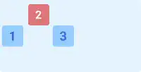
Practice
Objective:
Check how the align-self property works
1. Update the body section in the HTML file
Add the code below in the <body> section of the chapter15.html file. We use the same classes as the ones set before. There is no need to set new classes.
To see the result clearly, we added align-items: center to the parent elements in the last two cases.
<h2>align-self</h2>
<h3>Original Position</h3>
<div class="flex-container" style="display: flex; height: 100px;">
  <div class="flex-item">1</div>
  <div class="flex-item">2</div>
  <div class="flex-item">3</div>
</div>

<h3>align-self: flex-start</h3>
<div class="flex-container" style="display: flex; height: 100px;">
  <div class="flex-item">1</div>
  <div class="flex-item" style="align-self: flex-start;">2</div>
  <div class="flex-item">3</div>
</div>

<h3>align-self: center</h3>
<div class="flex-container" style="display: flex; height: 100px;">
  <div class="flex-item">1</div>
  <div class="flex-item" style="align-self: center;">2</div>
  <div class="flex-item">3</div>
</div>

<h3>align-self: flex-end</h3>
<div class="flex-container" style="display: flex; height: 100px;">
  <div class="flex-item">1</div>
  <div class="flex-item" style="align-self:flex-end;">2</div>
  <div class="flex-item">3</div>
</div>

<h3>align-self: stretch (align-items:center) @ Parent</h3>
<div class="flex-container" style="display: flex; height: 100px; align-items: center;">
  <div class="flex-item">1</div>
  <div class="flex-item" style="align-self:stretch;">2</div>
  <div class="flex-item">3</div>
</div>

<h3>align-self: baseline (align-items:center) @ Parent</h3>
<div class="flex-container" style="display: flex; height: 100px; align-items: center;">
  <div class="flex-item" style="font-size: 2rem;">1</div>
  <div class="flex-item" style="align-self: baseline;">2</div>
  <div class="flex-item" style="font-size:1.5rem;">3</div>
</div>
<hr>
2. Check the result with a browser
- Open chapter15.html with a browser.
- You can see how the
align-selfproperty adjusts the positions of a specific flex item.
You can also check the sample result here (Demo Site).


