Chapter 5. Building Responsive Website

AI-powered coding is now changing web development approaches—automating repetitive tasks and boosting productivity. With the AI tools, developers can now streamline their workflows, allowing more time for creativity and complex problem-solving.
Recent Trends of AI and AI-Powered Tools
Recent Trends in AI and AI-Powered Tools Over the last couple of decades, AI has rapidly transformed from a concept of some future time into a robust, real-time technology currently changing the face of industries all over the world. AI is gradually penetrating into all industries, whereby businesses, governments, and people start integrating AI-powered tools into their work to improve productivity and decision-making by simplifying processes that are cumbersome.
AI is no longer only used in academic research or high-tech labs; rather, it plays an intimate role with us all in our everyday lives, whether at work, in communication, or even problem-solving.
The Growing Influence of AI
The growth in machine learning, deep learning, and NLP[1]-constituent parts of modern AI has been phenomenal over the last decade. In this regard, AI is said to be able to process large volumes of data, learn from them, draw the necessary inferences, or carry out tasks that no human could do. In application, AI performed tasks automatically, predicted trends, and optimized operations.
Industry Use Cases of AI-Powered Tools
AI is now applicable to almost all sectors. For example, AI-powered diagnostics in healthcare help doctors detect diseases like cancer at an early stage and more effectively. AI systems can go through the medical images, study the history of the patients, and suggest options for the treatment, which is generally much quicker to do than by healthcare providers.
Meanwhile, AI in finance enables fraud identification, risk management, and personalized financial planning, while allowing the institutions to work with enormous volumes of transactions with minimal human error.
AI-powered tools will definitely make a difference in retail. AI, along with recommendation algorithms, enables an e-commerce website to provide users with personalized suggestions about their preferences, making the experience far better and increasing sales.
Artificial intelligence-powered automation smoothes production lines, reduces downtime, and efficiently manages the value chain in manufacturing.
AI technologies are even used to create content, edit images, and compose music in creative industries like design and media, and this in return frees human professionals for truly creative work.
These examples show that AI-powered tools will be helpful in a wide range of fields, including solving particular problems and increasing efficiency.
AI-Powered Coding Tools
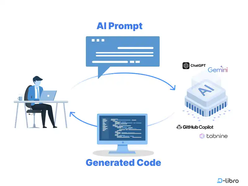
AI-powered coding tools may be the most famous and extended use cases of AI. They are going to revolutionize the way developers write, test, and optimize code. AI tools can assist developers in code generation, detection of errors, and optimization of performance so that one may develop programs with greater speed and less human error.
As we explore AI-assisted HTML and CSS coding, it’s clear that AI tools will play a significant role in shaping the future of web development. Whereas conventionally coding has relied on man's direct input, AI coding assistants now make a developer improve in constructing a website or even an application.
What We Cover in This Chapter
In this chapter, we’ll explain how AI helps your coding and how to use AI coding tools. The following topics are covered in this chapter.
- Generative AI for HTML & CSS Coding: A New Era of Development
- AI Coding Tools: Boost Efficiency with AI-Powered Solutions
- Master HTML & CSS with ChatGPT: Your AI Code Generator
Here is the summary of this chapter.
Generative AI for HTML & CSS Coding
Generative AI is reshaping the approaches to HTML and CSS coding by automating repetitive tasks and enhancing creativity. With AI, developers can produce functional HTML and CSS code based on simple prompts, saving time and reducing errors. For example, generative AI gives way to the creation of responsive layouts and CSS modern styles that will enable designers to create adaptable designs for different screen sizes with much more ease. The developer gets free with just base code creation from their end, while AI gives a real implementation showcase, starting from responsive structures down to minimalist navigation bars.
AI Coding Tools: Boost Efficiency with AI-Powered Solutions
AI coding tools are now used to streamline the workflow through code generation, error detection, and optimization. Tools like GitHub Copilot and Tabnine enhance productivity by reducing repetitive tasks. DeepCode and SonarQube are two other tools that help developers maintain clean and efficient code. These AI-powered tools let the developers concentrate on creative problem-solving. The AI tools are also effective for learning how to code with real-time output generation and feedback. This guide introduces popular AI tools that help developers write, analyze, and refine code efficiently, ultimately improving productivity and code quality.
Using ChatGPT as AI HTML Code Generator
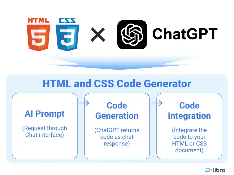
ChatGPT can be an integrated AI assistant for developers to generate and review code in HTML and CSS. It is especially useful for beginners who don’t have much experience in coding. Through a conversational chat interface, ChatGPT helps users generate code snippets, debug issues, and tailor code to specific requirements. With free and paid model options, users can select the best version for their coding needs. This guide explains how to set up ChatGPT step by step and provides how to effectively use it as a code generator.
[1] Natural Language Processing
Learn offline for better focus!
A book for this course is available on Amazon.
Master HTML & CSS Coding with AI
Revolutionize Your Learning Journey in Web Development and AI Coding for Beginners
Get the Book Now


