Menu

Log in

Sign up

From beginner to master of web design, coding, infrastructure operation, business development and marketing

  • COURSES
  • HTML & CSS Introduction
  • HTML & CSS Coding with AI
  • Linux Introduction
  • Docker Basics
  • Git & GitHub Introduction
  • JavaScript Coding with AI
  • Django Introduction
  • AWS Basics
  • Figma Introduction
  • SEO Tutorial for Beginners
  • SEO with AI
  • OTHERS
  • About
  • Terms of Service
  • Privacy Policy

© 2024 D-Libro. All Rights Reserved

Figma IntroductionChapter 4. Wireframing with Figma

Practice Wireframe Design in Figma

Practice Wireframe Design in Figma

Practice Wireframe Design in Figma

Wireframe design is an essential skill for creating clear, functional, and user-friendly interfaces. This guide provides hands-on practice using Figma, enabling you to apply key techniques and design principles to develop effective wireframes. By the end of this guide, you'll have the skills necessary to craft intuitive layouts that enhance user experience (UX) and streamline the development process.

In this section, we’ll cover the following topics.

  • Designing UI by Functionality
  • UI for Signup, Login, and Logout
  • UI for Main & Post Items
  • UI for User Group Registration
  • UI for My Posts (View, Edit, and Delete)
  • UI for Search Items
  • UI for Account Settings
  • Adjusting UI for Different Device Types

Designing UI by Functionality

When designing a user interface (UI), it's important to consider the overall user experience (UX). Grouping your UI design by functionality can help you think through how users will interact with each feature, anticipating their needs and reactions. In this section, we'll explore approaches to designing UI by functionality, using a photo-sharing app as an example.

UI Design by Functionality for a Photo-Sharing App

In our example, the app's frames are divided into six key functionality groups:

  1. Signup, Login, and Logout
    These are essential, commonly used functionalities. The UI design for these features is typically straightforward, focusing on simplicity and ease of use.
  2. Main Page & Media Data Items (View and New Post)
    The main page is the most critical aspect of the UI, as it serves as the app's "face." Special attention must be given to the data structure, especially in social media apps where media content is managed systematically. The UI should reflect this structure, ensuring that users can easily navigate and interact with the content.
  3. Community Registration
    This feature allows users to create and manage groups within the app. When designing this UI, it’s crucial to have a clear process for how users will register and join groups, whether through open signup, invitation, or another method.
  4. My Posts (View, Edit, and Delete)
    This functionality enables users to manage their own content. Key design considerations include how posted items are displayed and how users can easily view, edit, or delete their posts.
  5. Search Items
    Search functionality is fundamental in most apps. From a UI perspective, the challenge is to design an interface that effectively displays search results, ensuring that users can quickly find what they’re looking for.
  6. User Settings
    For apps with membership functionality, a user settings interface is essential. The UI should allow users to manage various account settings, including the option to deregister from the app if necessary.

UI for Signup, Login, and Logout

If you've already prepared the necessary design assets, creating the UI for user login and logout in Figma involves primarily copying, pasting, and aligning objects. This process is straightforward but crucial for ensuring a consistent and polished look.
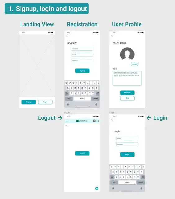
UI for Signup, Login, and Logout in Figma

Signup, Login, and Logout UI Examples

The following demonstration videos illustrate the basic operations for designing these UIs:

  • Utilize Assets: Drag and drop assets into your design frame when using them for the first time.
  • Copy and Paste: Reuse assets within your frame by copying and pasting them.
  • Override: Customize components by overriding properties such as text or colors.

Watch the video below.

Navigation Bar / App Top Bar

The UI of the navigation or top bar often changes depending on the user's login status. For our photo-sharing app, the navigation bar is only visible to signed-in users, meaning it appears after login but not during the login process itself.

UI for Main & Post Items

The main screen is the most critical element in your UI, particularly for social media apps where media content is central. The design should not only look appealing but also be structured in a way that efficiently organizes and presents media data.

Subscribe now for
uninterrupted access.

Sign up for free trial

Figma Introduction
Course Content

Chapter 1. Introduction To Figma

Figma Quick Start Guide

Figma User Interface (UI) and Version Control

Figma Plugins

Chapter 2. Figma Basic Tools

Figma Design File Structure and Toolbar

Figma Design Object Properties

Figma Layout and Object Alignment Tools

Constraints in Figma

Figma Auto Layout

Nested Frames in Figma

Masking and Boolean Operations in Figma

Figma Component Basics

Figma Component Variants and Interactive Components

Styles in Figma

Exporting Figma Designs and Slicing

Chapter 3. App UI Design Basics and Concept Design with Figma

App UI Design Basics: How To Design App UI

App UI Design Elements

App UI Design Principles

App Concept Design (Storyboard) with Figma

Chapter 4. Wireframing with Figma

Designing User Flows and Wireframe Layouts

Preparing Wireframe UI Components

Figma Screen Mirroring for Mobile and Tablet UI

Practice Wireframe Design in Figma

Chapter 5. Mockup Design with Figma

Color Themes and Text Styles in Mockups

Practice Mockup Design in Figma

Chapter 6. Prototyping Interactive Designs with Figma

How To Use Figma Prototype Features

Prototype Interaction Settings and Practice

Advanced Interaction Settings

FAQ: Practice Wireframe Design in Figma

Why is wireframe design important in UI/UX design?

Wireframe design is essential for creating clear, functional, and user-friendly interfaces. It allows designers to plan and structure a layout without getting distracted by visual details, ensuring that the user experience (UX) is intuitive and effective.

How should media post content be displayed in a photo-sharing app?

Media content can be displayed in two main views:

  • Detail View: Shows individual media items.
  • List View: Displays multiple items at once.
    For the main view, organize media content effectively, considering device size. Horizontal scrolling is often used on mobile devices to manage limited screen space.

What should be considered when designing the UI for search functionality?

Designing a UI for search functionality involves more than just placing a search icon or box. The results should be displayed in a way that prioritizes ease of use and effective navigation through the items found.

What are the key elements of a user settings interface in a membership-based app?

The user settings interface should allow users to manage various account parameters. In a photo-sharing app, this might include managing profiles, viewing registered communities, and having the option to deregister from the app or communities.