Practice Mockup Design in Figma
Creating a mockup is a critical step in the design process that transforms your conceptual UI designs into tangible, high-fidelity representations. This hands-on guide provides practical exercises in Figma, equipping you with the techniques needed to craft polished, professional-grade mockups. By the end of this practice session, you will have the confidence and skills to design visually engaging and detailed interfaces that resonate with your target audience.
In this section, we’ll cover the following topics.
- Adding a Background Image to a Launch Screen
- Customizing Avatars and Images
- Inserting Multiple Images Efficiently
- Inserting Images into Components
- Overriding Images and Texts in Instances
- Selecting Multiple Images in Nested Instances
Adding a Background Image to a Launch Screen
A well-designed launch screen sets the tone for the entire user experience, making it a key element in mobile app and web app design. Utilizing a background image is a popular approach for creating captivating launch screens and landing pages. The image serves as a visual backdrop, often enhanced with a translucent overlay to maintain readability while highlighting the brand or product.
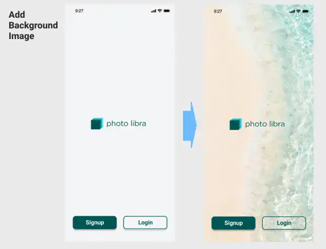
In the example shown above, a background image is seamlessly integrated into the frame, with a translucent layer added to create depth and focus. This technique is demonstrated in the video linked below, where we utilize the Unsplash plugin to effortlessly insert the image into the design. Watch the video below.
Customizing Avatars and Images
Personalization is a crucial aspect of modern UI design, and avatars play a significant role in creating a personalized user experience. In this section, you'll learn how to add a user avatar and customize image icons using Figma's powerful plugins, Content Reel and Unsplash.
FAQ: Practice Mockup Design in Figma
Why is creating a mockup important in the design process?
Creating a mockup is essential because it transforms your conceptual UI designs into tangible, high-fidelity representations. This step helps you visualize the final product, allowing you to refine details and ensure the design meets user expectations before moving on to development.
How can I customize avatars and images in my mockup?
Customizing avatars and images involves several steps:
- Create a circular shape as a placeholder for the avatar.
- Replace the default icon with a selected avatar image using the Content Reel plugin.
- Customize other image icons by selecting placeholders.
- Use a plugin, such as the Unsplash, to insert relevant images that match the theme of your app.
What is the most efficient way to insert multiple images into a Figma design?
To insert multiple images efficiently:
- Select all image placeholders in your design.
- Launch the Unsplash plugin and choose a thematic category relevant to your design.
- The plugin will automatically place randomly selected images from the chosen theme into the placeholders, saving time and ensuring a cohesive visual style.
How do I insert images into Figma components?
When working with Figma components, insert images directly into the base component. This ensures that all instances of the component automatically update with the new images, maintaining consistency across your design.
Can I override images and texts in component instances in Figma?
Yes, Figma allows you to override specific properties within instances, such as images and text. This flexibility enables you to create varied content across different instances without altering the original component structure, adding realism and dynamism to your mockup.
How do I select multiple images in nested instances in Figma?
To select images in nested instances, click on the image multiple times until you reach the desired layer. The number of clicks needed depends on the structure of the component. To select multiple images simultaneously, hold down the Shift key while clicking.
What should I check when completing my mockup?
When completing your mockup, ensure consistency across all design elements. This includes verifying that images, components, and other visual elements are cohesive across different views and screens. For example, the images in list views should match those in detailed views to maintain a consistent user experience.
Subscribe now for
uninterrupted access.