Position Property in CSS: Position Absolute and Relative

In web development, mastering the CSS position property is crucial for creating responsive layouts and managing how elements appear on a webpage. Two of the most commonly used position properties are position absolute and relative. Understanding the differences between these two positioning methods allows you to control the placement of elements with precision, leading to dynamic and flexible web designs.
In this guide, we’ll explore the CSS position property and dive into absolute and relative position in CSS. We'll also walk through examples of how to use these properties and provide hands-on case studies that you can practice on your own.
In this section, we’ll cover the following topics:
- What is the Position Property in CSS?
- Position Absolute and Relative
- Utilizing Position Absolute and Relative with AI
- Best Practices for Using Position Absolute and Relative
What is the Position Property in CSS?
The CSS position property is essential for controlling the layout of web elements on a page. This property specifies the positioning method used for an element (static, relative, absolute, sticky, or fixed). Depending on the value set, elements can be positioned based on their normal flow or can be explicitly placed relative to a container or viewport.
The Role of the Position Property in CSS
The position property determines how an element is rendered in the document flow. By default, HTML elements follow a static position, where each element flows sequentially on the page. Changing the position to relative, absolute, or fixed provides more control, allowing you to manipulate how elements stack, overlap, and interact with other content.
Commonly Used Position Property Values
There are several position values available in CSS:
- Static: This is the default position where elements are rendered in the normal document flow.
- Relative: Elements remain in the normal document flow but can be offset from their default position.
- Absolute: Elements are removed from the normal document flow and positioned relative to their nearest ancestor element that has the position relative property (or the body element if there is no ancestor element that has the position relative property).
- Sticky: Combines relative and fixed positioning, keeping an element in the flow until it reaches a certain scroll point.
- Fixed: Positions elements relative to the viewport, keeping them fixed in place even when scrolling.
Note: Position sticky and fixed will be covered in the next guide.
Position Absolute and Relative
Absolute and relative position play crucial roles in determining the layout of elements. While relative positioning allows slight adjustments while keeping an element in the normal document flow, absolute positioning allows the removal of elements from the flow to place them precisely.
How Position Relative Works in CSS Layouts
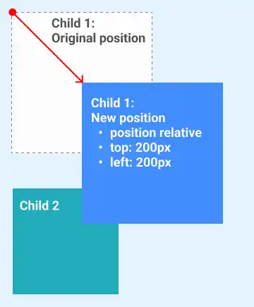
When an element is set to position: relative, it remains in the normal document flow but can be shifted from its original position using offset properties like top, bottom, left, and right.
For example, if there are two child boxes inside a parent box, you can move only Child 1 without affecting the position of Child 2 by using position: relative. The new position of Child 1 is defined relative to its original position.
Example: Position Relative Code
.child-1 {
  position: relative;
  top: 200px;
  left: 200px;
}

How Position Absolute Works in CSS Layouts
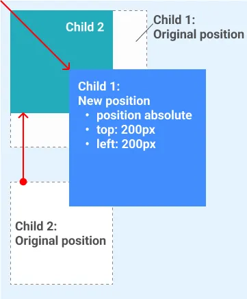
Elements with position: absolute are removed from the normal document flow and are positioned relative to the nearest ancestor that has a position other than static. If no such ancestor exists, the element is positioned relative to the initial containing block, typically the <html> element.
For example, if there are two child boxes inside a parent box, you can remove Child 1 from the normal document flow and position it relative to its parent. In this case, the parent element should have the position: relative property.
Example: Position Absolute Code
.parent {
  position: relative;
}

.child-1 {
  position: absolute;
  top: 0px;
  right: 0px;
}

Note: You can see that the child 2 element behaves as if the child 1 element doesn’t exist.
Utilizing Position Absolute and Relative with AI
In modern web development, AI tools can simplify complex tasks. In this section, we'll walk through how you can use AI tools to generate CSS for position absolute and relative. We'll also provide case studies that you can practice on by following the structured folder setup.
Preparing for Practice Files
This course takes a hands-on approach, allowing you to apply the techniques covered in real-world scenarios. Before proceeding with the examples, ensure the following files are prepared:
/your-project-folder/
    ├── 04-06-position-property/ (<- sub-folder)
        ├── example-1.css
        ├── example-1.html
        ├── example-2.css
        ├── example-2.html
For your convenience, these files are also available on our GitHub repository. You can download the practice files to follow along with the case studies presented in this guide.
AI Case 1: Utilizing Position Relative
In this case study, we'll explore how the position: relative property affects the layout by comparing default static positioning with relative positioning. We'll use one parent box and two child boxes to demonstrate the differences.
Sample AI prompt:
Generate HTML and CSS code examples to demonstrate the role of the position: relative property, using one parent box (light blue, 500x500px) and two child boxes (200x200px, light green and light yellow).
- Example 1: Default positions (both child elements have position: static)
- Example 2: position: relative (move child box 1 200px to the right and 200px down)
Sample code output:
<!DOCTYPE html>
<html lang="en">
  <head>
    <meta charset="UTF-8" />
    <title>Position Relative Example</title>
    <link rel="stylesheet" href="example-1.css" />
  </head>
  <body>
    <h2>Example 1: Default Positions (Static)</h2>
    <div class="parent-box">
      <div class="child-box-1">Child Box 1</div>
      <div class="child-box-2">Child Box 2</div>
    </div>

    <h2>Example 2: Position Relative (Child Box 1 Moved)</h2>
    <div class="parent-box">
      <div class="child-box-1 relative">Child Box 1</div>
      <div class="child-box-2">Child Box 2</div>
    </div>
  </body>
</html>
body {
  font-family: Arial, sans-serif;
}

h2 {
  margin-top: 30px;
  text-align: center;
}

.parent-box {
  background-color: lightblue;
  width: 500px;
  height: 500px;
  margin: 20px auto;
  padding: 50px;
  position: relative;
}

.child-box-1,
.child-box-2 {
  width: 200px;
  height: 200px;
  margin-bottom: 50px;
}

.child-box-1 {
  background-color: lightgreen;
}

.child-box-2 {
  background-color: lightyellow;
}

/* Example 2: Applying position relative */
.relative {
  position: relative;
  top: 200px; /* Move 200px down */
  left: 200px; /* Move 200px to the right */
}
Instructions to see the results:
- Save the code above in
example-1.htmlandexample-1.cssin the04-06-position-propertyfolder. - Open
example-1.htmlin your browser to view the differences between the default static positioning and the use ofposition: relative. In Example 2, Child Box 1 has been moved 200px to the right and 200px down usingposition: relative.
Visit this link to see how it looks in your web browser.
AI Case 2: Utilizing Position Absolute
In this case study, we'll examine how the position: absolute property affects element positioning by comparing default static positioning with absolute positioning. We'll use one parent box and two child boxes to illustrate the impact.
Sample AI prompt:
Generate HTML and CSS code examples to demonstrate the role of the position: absolute property, using one parent box (light blue, 500x500px) and two child boxes (200x200px, light green and light yellow).
- Example 1: Default positions (both child elements have position: static)
- Example 2: position: absolute (set top: 200px and left: 200px)
Sample code output:
<!DOCTYPE html>
<html lang="en">
  <head>
    <meta charset="UTF-8" />
    <title>Position Absolute Example</title>
    <link rel="stylesheet" href="example-2.css" />
  </head>
  <body>
    <h2>Example 1: Default Positions (Static)</h2>
    <div class="parent-box">
      <div class="child-box-1">Child Box 1</div>
      <div class="child-box-2">Child Box 2</div>
    </div>

    <h2>Example 2: Position Absolute (Child Box 1 Moved)</h2>
    <div class="parent-box relative-parent">
      <div class="child-box-1 absolute">Child Box 1</div>
      <div class="child-box-2">Child Box 2</div>
    </div>
  </body>
</html>
body {
  font-family: Arial, sans-serif;
}

h2 {
  margin-top: 30px;
  text-align: center;
}

.parent-box {
  background-color: lightblue;
  width: 500px;
  height: 500px;
  margin: 20px auto;
  padding: 50px;
  position: relative; /* Establishes positioning context */
}

.child-box-1,
.child-box-2 {
  width: 200px;
  height: 200px;
  margin-bottom: 50px;
}

.child-box-1 {
  background-color: lightgreen;
}

.child-box-2 {
  background-color: lightyellow;
}

/* Example 2: Applying position absolute */
.absolute {
  position: absolute;
  top: 200px;
  left: 200px;
}
Instructions to see the results:
- Save the code above in
example-2.htmlandexample-2.cssin the04-06-position-propertyfolder. - Open
example-2.htmlin your browser to compare the default static positioning with the use ofposition: absolute. In Example 2, Child Box 1 is repositioned relative to the parent usingposition: absolute, while Child Box 2 is positioned as if Child Box 1 is no longer in the document flow.
Visit this link to see how it looks in your web browser.
Best Practices for Using Position Absolute and Relative in CSS
Mastering position: absolute and position: relative in CSS allows you to design more flexible, interactive layouts. Following these best practices will help you use these properties effectively:
- Define a Positioning Context with
Relative: Setposition: relativeon a parent container to create a reference point for absolutely positioned child elements. This helps maintain control over layout and prevents unintended overlaps. - Minimize Use of
AbsolutePositioning: Whileposition: absoluteis useful for precise placements, overuse can lead to complex layouts that are difficult to maintain. Use absolute positioning for elements that do not need to adapt dynamically with page resizing. - Avoid Excessive Offsets: Limit the use of
top,right,bottom, andleftoffsets in absolute and relative positioning to small adjustments. Large values can make layout management challenging, especially on smaller screens. - Combine with CSS Grid or Flexbox: Use CSS Grid or Flexbox for primary layout structures and reserve absolute/relative positioning for fine-tuning or special elements. This approach balances structure with flexibility.
- Test Across Viewports: Ensure your layout remains functional and visually appealing on different screen sizes. Position properties can behave differently based on viewport changes, so thorough testing is key.
By following these practices, you’ll gain better control over your layouts, creating organized, responsive designs that enhance user experience.


