Figma Layout and Object Alignment Tools

Figma’s layout and alignment tools are essential for creating well-structured, visually balanced designs. In this guide, we’ll explore how to effectively use grids, guides, and alignment options to ensure your design elements are perfectly placed. Whether you’re arranging simple components or complex layouts, mastering these tools will enhance your design precision.
In this section, we’ll cover the following topics.
- Object Alignment
- Layout Grid
- Practical Use of Layout Grids and Alignment Tools
Object Alignment
Object alignment in Figma is vital for creating clean, organized designs, particularly in app UI design, where consistency is key to user experience. Proper alignment eliminates visual clutter, ensuring that your interface elements are precisely positioned.

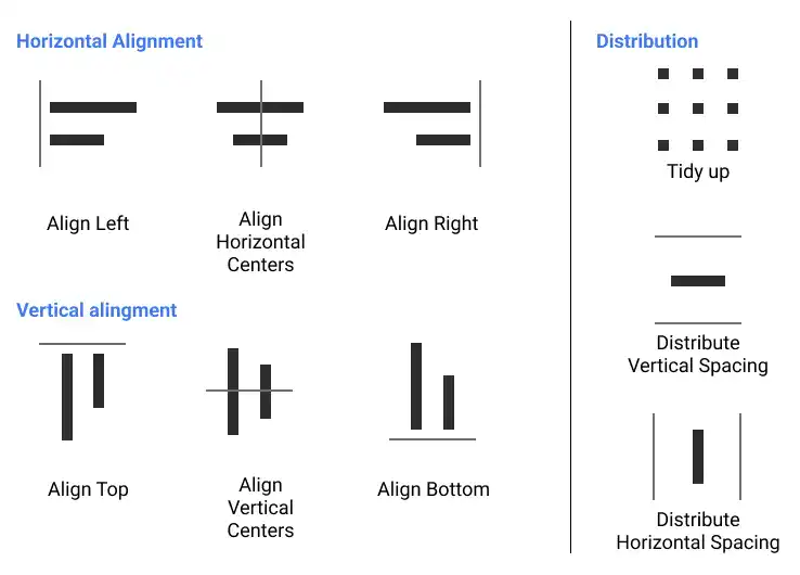
Horizontal alignment
- Align left: Aligns the left edges of the selected objects with the leftmost object, creating a uniform left edge.
- Align horizontal centers: Aligns the selected objects based on the centerline between the leftmost and rightmost objects, ensuring symmetry.
- Align right: Aligns the right edges of the selected objects with the rightmost object, standardizing the right edge.
Vertical alignment
- Align top: Aligns the top edges of the selected objects with the highest object, creating a consistent top line.
- Align vertical centers: Aligns the selected objects based on the centerline between the topmost and bottommost objects, ensuring balanced vertical spacing.
- Align right: Aligns the bottom edges of the selected objects with the lowest object, creating a uniform bottom edge.
Distribution
Distribution tools in Figma help you evenly space objects, making your designs look more professional and organized.
- Tidy up: Automatically arranges selected objects into the most aligned positions, optimizing their layout.
- Distribute vertical spacing: Ensures equal vertical spacing between multiple objects, making the layout more cohesive.
- Distribute horizontal spacing: Ensures equal horizontal spacing between multiple objects, maintaining uniformity across your design.
Layout Grid

What is layout grid?
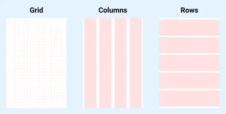
A layout grid in Figma is a structural tool that helps you design layouts with precision. Grids are especially useful in app UI design, where a consistent and responsive layout is crucial. A grid system, such as those used in popular frameworks like Bootstrap, allows for easy responsive design by providing a structured approach to aligning elements within a layout.
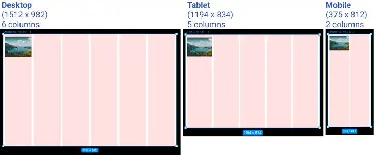
For responsive designs, you can set different numbers of columns for various device sizes. For instance, when designing a gallery that adjusts to different screen sizes, the grid system ensures that images are resized and aligned correctly across all devices. This prevents images from appearing too large or too small, maintaining a visually appealing layout regardless of the screen size.
In the following images, numbers of columns are different. You can see that the images don’t become too big or too small regardless of device sizes.

How to set up layout grid?
To set up a layout grid in Figma:
- Select a Frame: Start by selecting the frame where you want to apply the grid.
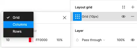
- Add Grid: On the right sidebar, you’ll find the grid properties. Click the + icon to add a new grid, which can be structured as columns or rows.
- Customize: You can customize the number of columns, the gutter width (the space between columns), and the margin (the space around the edge of the frame). This allows you to tailor the grid to fit the specific needs of your design.

Practical Use of Layout Grids and Alignment Tools
By combining layout grids with alignment and distribution tools, you can create designs that are not only visually appealing but also highly functional. For instance:
- Responsive Design: Use grids to ensure that your design adapts smoothly to different screen sizes. This is particularly useful for web and mobile applications where consistency across devices is key.
- Precise Layouts: Leverage alignment and distribution tools to arrange UI elements, such as buttons, text boxes, and images, ensuring they are perfectly aligned and spaced. This precision improves the overall user experience, making the interface more intuitive.