Navigating Figma: File Structure & Toolbar Essentials

Figma’s design file structure and toolbar are the foundation of efficient design work. This section provides a detailed overview, helping you organize your projects, manage layers, and make the most of Figma’s tools. By mastering these basics, you’ll enhance your workflow and create designs with greater ease and precision.
In this section, we’ll cover the following topics.
- Figma Design File Structure
- Figma Design Toolbar
Figma Design File Structure
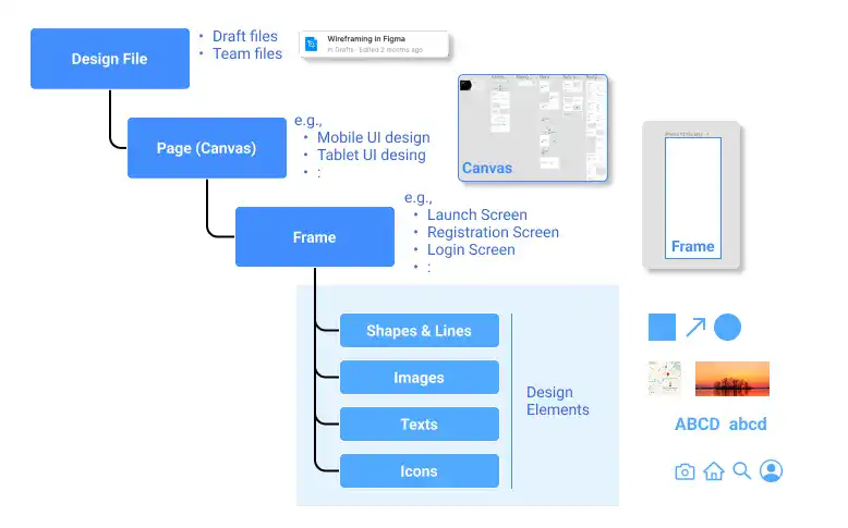
When starting a new Figma design project, it’s crucial to grasp the structure of the Figma design file to organize your work efficiently. Figma’s design file structure is organized into three main layers: Design File, Page (Canvas), and Frame. Each layer serves a distinct purpose in the design process, helping you manage complex projects with ease.
Design file
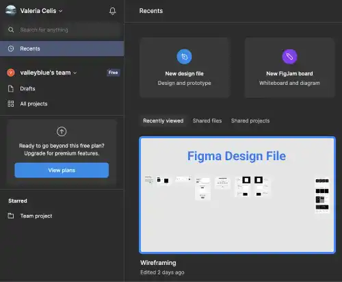
The Design File is the topmost layer in Figma and acts as the container for all your design work. When you open Figma, the files visible on the home screen are individual design files. Each file can be thought of as a separate project or a large section of a project. For instance, you might have one file for a website design and another for a mobile app.
- Multiple Files: Figma allows you to open and work on multiple files simultaneously. These files appear as tabs at the top of the desktop app or browser, making it easy to switch between different projects or versions of a design.
- Collaboration: Each design file is stored in the cloud, allowing for real-time collaboration. Multiple team members can work on the same file simultaneously, seeing each other’s changes instantly.
Pages
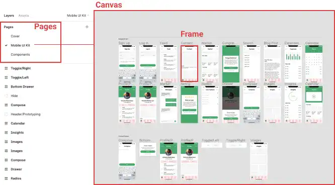
Within each Design File, you can create multiple Pages. Pages are used to organize different sections or versions of your design within the same file. For example, you might have one page dedicated to the mobile UI and another for the tablet UI, or separate pages for different features of a product.
- Canvas: Each page contains a Canvas where the actual design work happens. The canvas is where you place and arrange your frames and elements. While the canvas has a finite size (from -65,000 to +65,000 on each axis), it provides ample space for designing multiple screens and iterations within the same page.
- Background Color: You can customize the background color of each canvas to suit your design needs, helping to differentiate between pages or simply setting the tone for your project.
Frames
The Frame is the fundamental building block within the canvas where the majority of your design work takes place. Frames are essentially containers for design elements, such as text, images, and shapes. They can represent anything from a single UI element like a button to an entire screen layout.
- Multiple Frames: You can create multiple frames on a single canvas, organizing them in a way that reflects the flow of your design. For instance, you might have one frame for the home screen, another for the settings screen, and so on.
- Flexible Layouts: Frames are highly flexible and can be nested within each other, allowing for the creation of complex, hierarchical designs. This makes it easy to manage responsive layouts or component-based designs, where smaller elements are grouped within larger containers.
Layers
Layers in Figma are crucial for organizing and managing design elements within a file, making navigation, editing, and collaboration more efficient. Here’s a quick guide on how layers work and how to use them effectively.
What Are Layers?
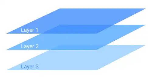
Layers represent individual design elements, such as shapes, text, images, or entire frames. They stack on top of each other, allowing you to control the visual hierarchy of your design.
Layer Panel
The Layer Panel on the left side of Figma displays all layers within a selected frame or group. The stacking order of layers in the panel corresponds to their order on the canvas.
- Visibility: Toggle the eye icon to hide or show layers.
- Locking: Lock layers to prevent accidental changes; locked layers remain visible but uneditable.
Layer Manipulation
Figma offers tools and shortcuts for easy layer manipulation:
- Rearranging: Drag layers in the Layer Panel to change their order.
- Grouping: Use Ctrl + G (Windows) or Cmd + G (Mac) to group layers; ungroup with Shift + Ctrl or Cmd + G.
- Duplicating: Duplicate layers with Ctrl or Cmd + D.
- Alignment: Use alignment tools for precise and consistent layouts.
Steps to Start a New Design Project in Figma
- Create a New Design File: Begin by creating a new design file from the home screen. This file will serve as the container for all your design work.
- Rename the File: Update the default name (typically "Untitled") to something more descriptive that reflects the content or purpose of the project.
- Rename the Page: Update the page name within the file to help organize your work, especially if you plan to create multiple pages for different aspects of your project.
- Create a New Frame: Select the appropriate device size and create a new frame. This frame will be your primary workspace where the design elements are placed and arranged.
- Begin Your Design Work: With the frame set up, you’re ready to start designing. Add elements, apply styles, and begin building your project.
Watch the video below to see a step-by-step guide on how to start a new design project in Figma.
Figma Design Toolbar
Figma provides a range of essential design tools, each with its specific functions. Here’s an overview of the key tools available in the Figma Design Toolbar:
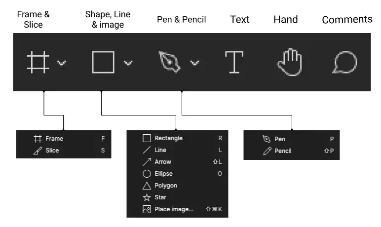
Figma provides most commonly used design tools. Here are some key points for each tool.
Move tool

The Move Tool in Figma is a fundamental tool used to select, move, and arrange elements within your design. It allows you to reposition objects on the canvas, whether they are frames, shapes, text, or other design elements.
Frame tool

The Frame Tool is fundamental in Figma, as it acts as a container for design elements. All design work typically occurs within frames. You can also create frames within frames, known as Nested Frames, which allows for complex layouts and designs. To quickly create a new frame, simply press the shortcut key F.
Section tool

The Section Tool in Figma is used to group and organize related frames or elements on the canvas, making it easier to manage complex designs. It helps keep your workspace organized and your design more navigable. To quickly create a new frame, simply press the Shift + S.
Slice Tool

The Slice Tool is used to export specific parts of a frame. This is particularly useful when you need to export a section of your design as an image or asset. Activate the Slice Tool by pressing S. We will explain how to use the slicing tool later in this chapter.
Shapes and Lines
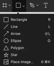
Figma offers a variety of shape and line tools for creating rectangles, lines, arrows, ellipses, and more. These tools can be customized easily to fit your design needs.
• Rectangle: R
• Line: L
• Arrow: Shift + L
• Ellipse: O
For a detailed demonstration of shape customization, refer to the video below.
Place image
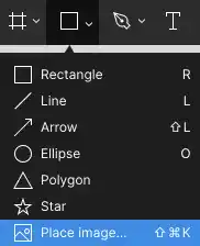
The Place Image function enables you to import images fr
om your computer into Figma.
Watch the video tutorials below.
Images can also be used as color fills for shapes or text. When you select a shape or text before placing an image, the image will be used as a fill for that element. Watch the video tutorials below.
Pen Tool

The Pen Tool allows you to draw Bezier curves, giving you the flexibility to create complex and precise shapes. Although it may take some practice to master, the Pen Tool is invaluable for detailed design work. Access it with the shortcut key P. You can practice using the Pen Tool on this Bezier curve practice website.
Pencil Tool

The Pencil Tool is designed for freehand drawing, allowing you to sketch directly onto the canvas. Activate it using the shortcut key Shift + P.
Text Tool

The Text Tool is used to create and edit text objects within your design. It’s straightforward and can be quickly accessed by pressing T.
Hand Tool

The Hand Tool allows you to navigate and move around the canvas easily, which is particularly helpful when working on large designs. Use the shortcut key H to activate it.
Comment Tool

The Comment Tool is a standout feature in Figma, designed for real-time collaboration. It enables team members to leave feedback directly on the design, fostering communication and iterative improvement. The shortcut key C lets you quickly add comments.