Explore Figma Component Variants & Interactive Elements

Figma’s Component Variants and Interactive Components empower designers to build more dynamic UI elements. By leveraging these features, you can create multiple variations of a component within a single design system and add interactivity to bring your prototypes to life. This guide will walk you through setting up and using these powerful tools effectively.
In this section, we’ll cover the following topics.
- Figma Component Variants
- Interactive Components
Figma Component Variants
Component Variants in Figma allow you to group multiple variations of a design element into a single component. This is incredibly useful when you want to manage different states, sizes, colors, or other variations without creating separate components for each.
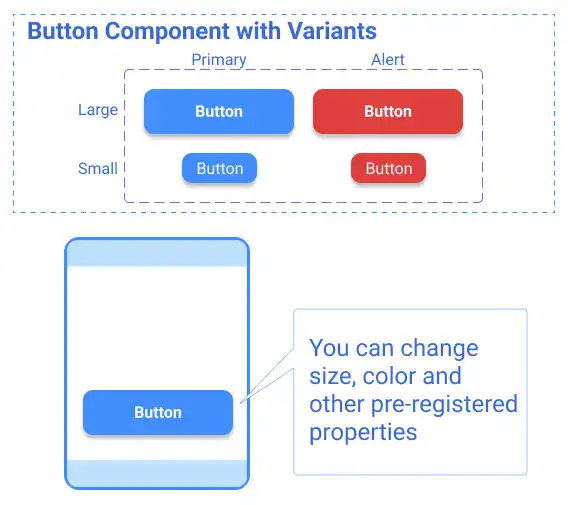
Register Component Variants
Creating and managing component variants is straightforward:
Step 1. Design Your Master Component:
Start by designing your primary component. This could be a button, icon, or any other UI element. Once you’re satisfied with the design, register it as a component by pressing Option + Command + K on a Mac (or Alt + Ctrl + K on Windows).
Step 2. Create Variants:
Duplicate the master component and make the necessary adjustments, such as changing text, color, or size. Register each duplicate as a new component.
Step 3. Combine as Variants:
Select all the components you’ve created and click the “Combine as Variants” button in the right-hand design sidebar. This groups your variations into a single component with multiple variants.
Step 4. Define Properties:
Add specific properties to each variant, such as “color,” “state,” or “size,” to easily differentiate between them and manage their usage.
The video below demonstrates steps 1-3 (creating component variants).
The video below demonstrates step 4 (adding properties).
Adjust Component Variants Properties
Once your variants are set up, you can easily adjust their properties in the right sidebar. Changes made here will automatically reflect in the variant names, making it easier to keep track of different states and versions within your design system.
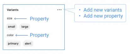
Edited properties also reflect in variant items’ names.
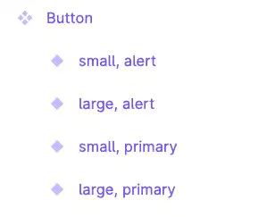
Use Component Variants as an Instance
Once you’ve created your component variants, using them in your design is simple. You can drag and drop the component from the Assets panel onto your canvas or copy and paste instances into your design. Each instance can be customized independently while maintaining a link to the original component.
This video demonstrates how to use the component variants.
To understand this feature in more detail, please go to the Figma official website.
Practical Use Cases for Figma Component Variants
Component variants can be applied in various scenarios to streamline your design process. Below are some common use cases:
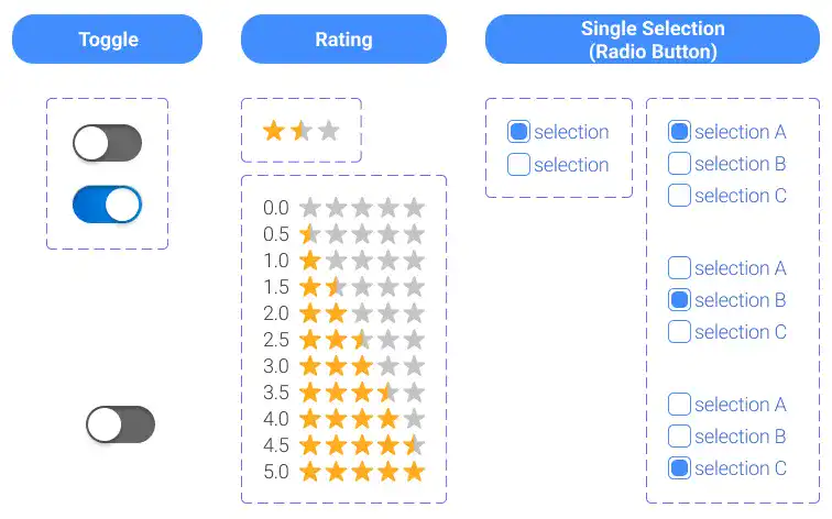
Toggle Switches:
Toggle is a simple switch often used in app UI design. The toggle has two statuses: on and off. When you make toggle variants, you should assign “on and off” property names for variant names like shown below.

When you set “on and off” or “yes and no” as variant names, Figma automatically detects the names and creates a switch to change the property setting of the component. This feature is only used for the cases of “on and off” or “yes and no”.

You can see how it works in the video below.
Star Rating Systems:
Creating a dynamic star rating system is made easy with component variants. Start by designing a single star as a variant, then use it to build a five-star rating component with different states (e.g., 1-star, 2-star, etc.).
First, you need to make a single-star variant. Watch the video below.
Then, you can use the single-star component to form five-star components with variants. Watch the video below.
Radio Buttons (Single Selection):
Radio buttons are commonly used in forms for single-choice selections. To create it, you need to make one set of checked and unchecked items first like shown in the video below. You can use this component to make a multiple-choice selection button.
To create a single-choice selection button, you need to make combinations of checked and unchecked items. Watch the video below.
Interactive Components
Interactive components are components with variants that can be dynamically changed based on users’ actions when demonstrating a prototype. For example, when a user taps a toggle button in a prototype, it switches to on or off.
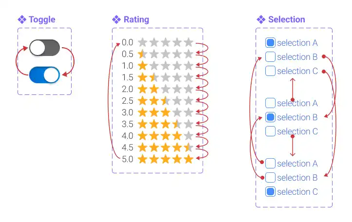
Create Interactive Components
If you already have a component with variants, creating an interactive component is relatively easy. Key steps to create interactive components are:
- Select the Component: Choose the component with variants that you want to make interactive in the frame used for your prototype.
- Add Interactions: Go to the Prototype menu on the right sidebar. Select a variant and add interactions. You can do this by selecting the “+” button on a variant and dragging it to the variant you want to connect it to.
- Configure Interaction Settings: Figma automatically suggests interaction types based on the component variants, but you can customize the following settings:
- User Action: Define what triggers the interaction (e.g., on tap, on drag).
- Triggered Event: Specify what happens after the user action (e.g., navigate to, change to).
- Destination: Choose the variant or frame that the interaction leads to.
- Animation: Select the type of animation for the transition (e.g., fade, slide).
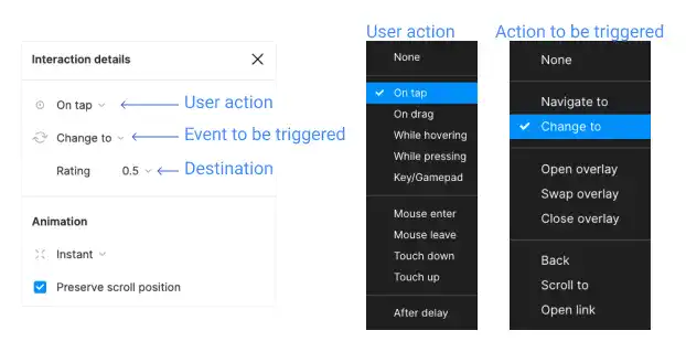
The most important setting for interactive components is the action to be triggered. It has to be “Change to”. By selecting this option, you can select a destination variant. For example, if you select “Navigate to”, the destination selections become frames on your canvas. We’ll cover in detail the interactions setting in Chapter 6.
Use Interactive Components in Prototypes
- Place a component: Insert the component with variants into the frame you’re using for the prototype.
- Test the Prototype: Click the play button in the top-right corner of Figma to launch the prototype and interact with your components in real time.
The following videos show demonstrations of the different types of interactive component use cases.
Toggle
Rating
Selection (Radio Button)
To understand these features in more detail, please check the Figma official video.
