Figma Component Basics: Build Reusable Design Elements

Understanding Figma components is essential for creating efficient, scalable designs. Components are reusable elements that ensure consistency throughout your project. By mastering the basics of components, you can significantly speed up your workflow, make updates easier, and maintain a cohesive design system across all your work.
In this section, we’ll cover the following topics.
- Key Features of Figma Components
- Create a Component
- Use a Component
- Parent Component vs. Child Component (Instance)
- Deregister a Component
- Override Component Properties
- Nested Components
Key Features of Figma Components
Figma components are versatile and powerful tools that offer several key features:
1. Design asset
Once you create a component from a Figma object or group of objects, you can reuse it multiple times throughout your project. This reusability ensures consistency and saves time. You can easily update the design of a component, such as changing colors or updating text, and those changes will automatically propagate to all instances of that component.
2. Component variants
Components can have multiple variants, allowing you to manage different versions of a design element within a single component. For example, you can create a button component with variants for different states (e.g., default, hover, pressed) or different sizes and colors. This helps keep your design system organized and makes it easier to swap between variations.
3. Interactive component
Interactive components are crucial for prototyping. They allow you to make component variants interchangeable in prototypes. For example, you can create a toggle switch or radio buttons that change states (e.g., on/off) during a prototype demonstration. This interactivity adds a layer of realism to your prototypes, helping stakeholders better understand how the final product will behave.
Create a Component
Creating a component in Figma is straightforward, and it’s the first step in building a reusable design system.
- Select the Item: Choose the design element or group of elements you want to turn into a component.
- Create the Component: Right-click on the selection and choose “Create Component,” or press Option + Command + K on a Mac (or Alt + Ctrl + K on Windows).
Watch the video below.
Use a Component
Using components in your design is easy and efficient:
- Drag and Drop: You can drag a component from the Assets panel onto your canvas, or copy and paste an instance directly into your design.
- Instance Management: You can create multiple instances of a component, each of which can be customized individually while still maintaining a link to the parent component.
Watch the video below.
Parent Component vs. Child Component (Instance)
Parent Component:
The original component you create, which acts as the master template for all instances.
Child Component (Instance):
A copy of the parent component that inherits its properties. When you make changes to the parent component, all instances are automatically updated. Watch the video below.
Deregister a Component
If you need to remove a component from your design system, you can deregister it:
- Delete the Component: Removing the component from the Assets panel will deregister it.
- Detach Instance: If you want to keep an item as a non-component object, create an instance and then detach it from the component. You can also restore a component from an instance if it was mistakenly deleted. To detaching instances, select the instance, go to the instance property on the right sidebar, and choose “Detach Instance.”
Watch the video below.
Override Component Properties
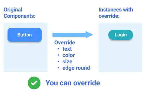
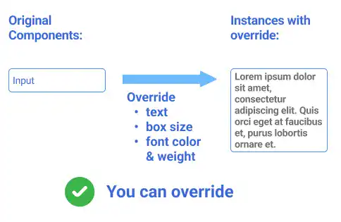
One of the powerful features of Figma components is the ability to override certain properties of instances. This allows for customization while maintaining the core design integrity of the parent component.
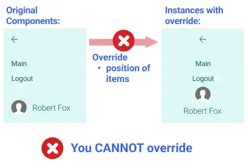
You can change most properties of the original components; however, you cannot change the position of nested items. Basically, the position of nested items of the component only follows constraint rules set for the parent component.
Example 1

Example 2

Example 2

For example, in the video example below, there are three types of constraint
- Arrow is fixed on the left and top
- Account icon and name are fixed on the left and bottom
- Texts are fixed only on the top
You cannot directly adjust the positions of each item. When the size of the instance changes, each item’s position moves but follows the constraint rules above. Watch the video below.
You can also reset overrides and roll the properties of the instance back to the original component properties. See the video below. Watch the video below.
Nested Components
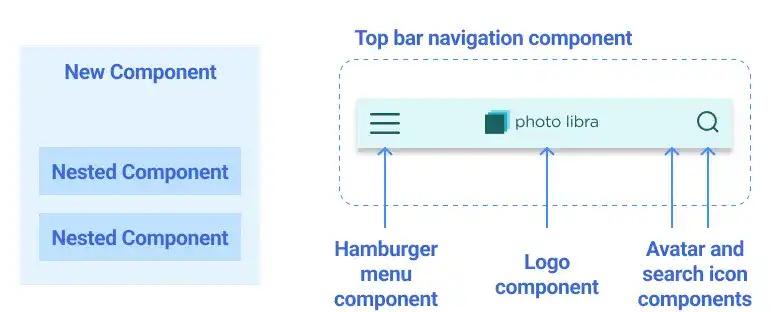
Nested components are another advanced feature in Figma that allows you to create complex, scalable designs. By nesting components within each other, you can build highly modular and flexible design systems.
- Creating Nested Components: Simply use existing components to create new ones. The original components become nested components within the new component.
- Impact of Changes: Any changes made to the original (nested) components will propagate through all instances where they are nested, ensuring consistency across your design system.

Check the video below to see how nested components change when the original component is modified.
