Figma Auto Layout: Create Responsive and Dynamic Designs

Figma’s Auto Layout feature is a game-changer for creating responsive and dynamic designs. Whether you’re building buttons, cards, or entire layouts, Auto Layout allows elements to automatically adjust and align based on content changes, making it easier to maintain consistency and efficiency in your design process.
In this section, we’ll cover the following topics.
- Auto Layout Basic Settings
- Auto Layout Container Constraint and Resizing Settings
- Auto Layout Item Resizing Settings
- Auto Layout Use Cases
Auto Layout Basic Settings
How to Initiate Auto Layout?
Auto Layout in Figma can be activated by selecting multiple objects or a frame and pressing Shift + A or by clicking the + button in the Auto Layout section on the right sidebar in the browser version (for the desktop version, select the auto layout icon). Once enabled, the position and alignment of items within the frame will be automatically adjusted according to the defined rules.
Basic setting of auto layout
Auto layout direction:

You can select horizontal, vertical, or wrap in the auto layout direction. You can choose between horizontal, vertical, or wrap directions for Auto Layout. This setting determines how your items are aligned within the frame.
Spacing:

Spacing defines the distance between items in your layout. For horizontal layouts, it controls horizontal spacing, and for vertical layouts, it manages vertical spacing.
Padding:

Padding sets the distance between the content and the edges of the frame. You can specify different padding values for the top, bottom, left, and right sides of the frame.
Position Alignment:
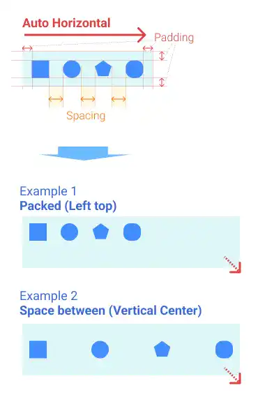
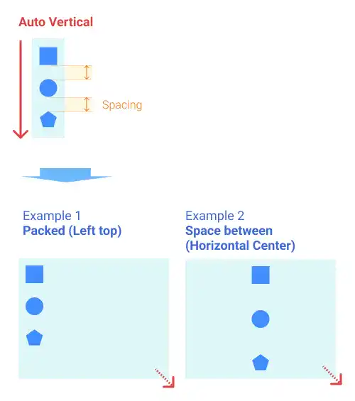
there are two types of alignment. Packed and Space-Between. You can change the settings by double-click.
- Packed: Aligns items to the selected edge. For example, selecting the top-left edge with the packed setting will align items to the top-left corner based on the defined padding and spacing
figma-auto-layout-position-alignment-settings-packed-id504110020510-img04
- Space-Between: Distributes items evenly based on the selected direction. For horizontal layouts, items are spaced horizontally; for vertical layouts, you can align items to the top, center, or bottom.
The illustrations below describe how position alignments work in horizontal and vertical auto layout settings.
Horizontal Auto Layout:
Vertical Auto Layout
Auto Layout Container Constraint and Resizing Settings
When using Auto Layout, it’s important to configure the constraints and resizing settings for your frames. First, we explain how to manage constraint and resizing settings at the container level (parent frame).
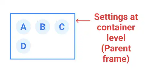
Watch the video below.
Constraints: Hug contents
With the Hug Contents setting, the frame size automatically adjusts to fit its contents. The alignment settings won’t affect the positions of items since the frame resizes to accommodate them.
Watch the video below.
Constraints: Fixed
When the Fixed constraint is applied, items align according to the Auto Layout settings rather than the constraints. For nested frames within a parent frame, constraints like left or top determine their position.
Watch the video below.
Auto Layout Item Resizing Settings
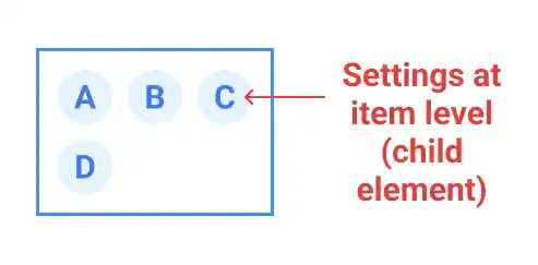
You can also set resizing approaches at the item level (child element level). To change the setting, select the items in the auto layout frame you are working on. You can set different settings for width and height of each item.
Fixed Width or Height
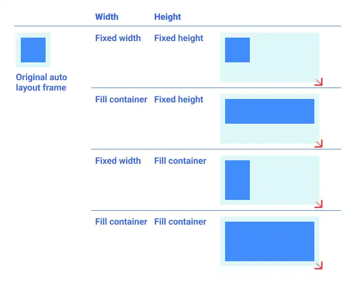
When you apply the Fixed setting to an item’s dimension, the dimension won’t change even when you change the size of the frame where the item is located.
Fill Container
When you select Fill Container, the item size follows the size of the frame. In this case, item sizes will be defined based on the padding and spacing settings.
Auto Layout Use Cases
Auto Resize Button

One of the most practical uses of Auto Layout is creating buttons that automatically resize based on their content. Here’s how to do it:
- Create a text object and type “Button”
- Press Shift + A to change the object to an auto layout frame
- Add the fill color of the frame and adjust the text color
- Adjust the edge of the object (add round)
- Add effects (e.g., add a drop shadow)
Watch the video below.
The created button can be auto resized. Watch the video below.
You can also enhance your button by adding an icon. Watch the video below.
Responsive Navigation Bar

Another common use case is creating a responsive navigation bar. By using the Space Between alignment, you can keep the brand logo centered while placing other icons at the edges. Watch the video below.
Responsive Card List
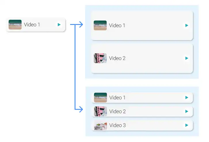
To create responsive list items, use nested frames and Auto Layout. Start by applying Auto Layout to one list item and adjusting its alignment and resizing settings. Then, duplicate the list item and group them within another Auto Layout frame. Set the sub-frames to Fill Container to ensure the list items adjust proportionally to the entire frame. Watch the video below.

