App UI Design Basics: Concept Creation with Figma

In this chapter, you'll explore the core principles of App UI design, from understanding basic design elements to developing comprehensive design concepts with Figma. Whether you're starting from scratch or refining your skills, this guide will help you create visually appealing and user-friendly interfaces that align with modern design standards.
UI Design Vs. UX Design
UI design is often explained together with UX (User Experience) design or design thinking. While UX design covers user’s experience along with the app user journey, UI design focuses on an app’s visual interface design. In this course, we focus on UI design; however, UI design and UX design are sometimes inseparable. When you are making a wireframe or prototype, you are also designing user experience. In that sense, we’ll also cover some UX elements in this course.
- UX (User Experience) design: Designing User’s experience along with the app user journey
- UI (User Interface) design: Designing Visual Interface of an app

In this chapter, we’ll explain App UI design basics and concept design using Figma.
The following topics are covered in this chapter.
- App UI Design Basics: How To Design App UI
- App UI Design Elements
- App UI Design Principles
- App Concept Design (Storyboard) with Figma
App UI Design Basics: How To Design App UI
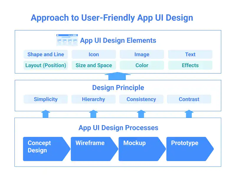
Creating an effective app UI design involves balancing aesthetics with functionality. Key elements like shapes, icons, text, and color, along with principles such as simplicity, hierarchy, consistency, and contrast, ensure a user-friendly interface. The design process includes concept design (setting vision), wireframing (structuring layout), mockup creation (applying visual identity), and prototyping (testing interactivity). By mastering these elements and stages, designers can create app UIs that are visually appealing, intuitive, and aligned with user needs and business goals.
App UI Design Elements
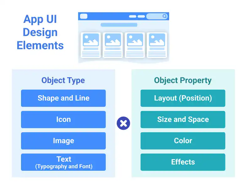
Mastering App UI design involves understanding and manipulating key design elements—shapes and lines, icons, images, and text—alongside critical properties like layout, size, space, color, and effects. Shapes and lines form the foundation of all design, while icons simplify navigation, and images enhance aesthetics. Typography requires careful control for readability. Layout guides user flow, and proper use of size and space prevents clutter. Color impacts emotions and usability, while effects add depth. By combining these elements and properties effectively, designers create visually appealing, functional, and intuitive user interfaces that enhance the overall user experience.
App UI Design Principles
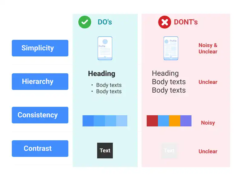
App UI design principles are essential for creating interfaces that are both visually appealing and user-friendly. The four core principles—Simplicity, Hierarchy, Consistency, and Contrast—guide designers in making thoughtful decisions that enhance usability and ensure the app aligns with its goals. Simplicity reduces clutter, making navigation easier. Hierarchy organizes elements to guide the user’s attention and actions. Consistency creates a familiar experience by maintaining uniformity across design elements. Contrast emphasizes key information, making it stand out. Together, these principles help designers craft intuitive and engaging user interfaces that improve overall user experience.
App Concept Design (Storyboard) with Figma
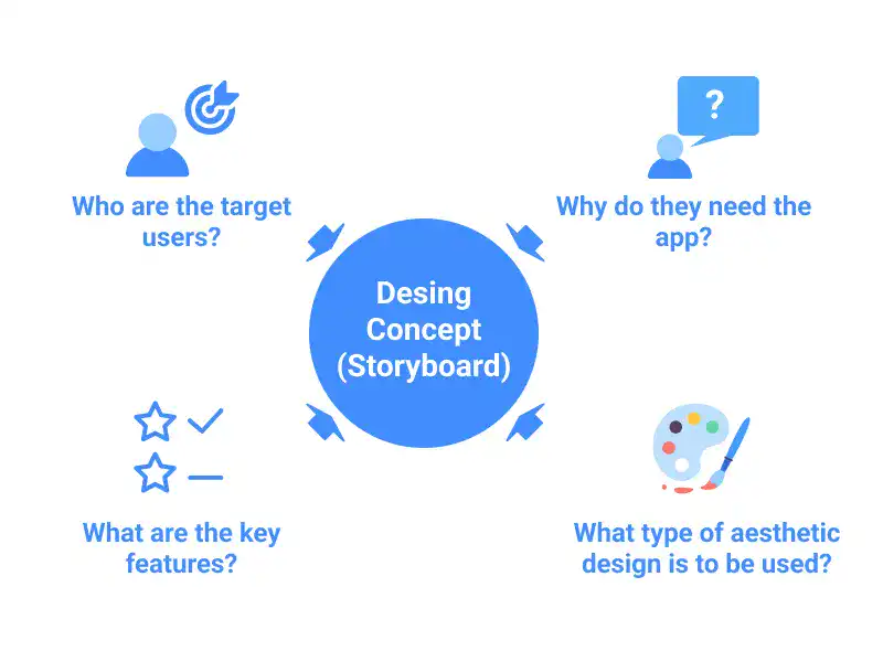
Creating an effective app concept starts with a well-structured storyboard, which outlines the app's purpose, target audience, key features, and aesthetic direction without diving into visual details. In Figma, this process is guided by four key questions: identifying the target users, defining the app’s value proposition, outlining essential features, and setting a preliminary aesthetic design. Additionally, creating a moodboard in Figma helps establish the visual style. This foundation ensures that the app’s design is both user-centered and visually cohesive.
Learn offline for better focus!
A book for this course is available on Amazon.
UI Design with Figma
From Beginner to Pro: Master UI/UX Design and Create Stunning Web & App Designs with Step-by-Step Guides to Wireframes, Mockups, and Prototypes.
Get the Book Now
