Basic CSS Code for Standard Styling

Styling a web page with CSS can be simplified using AI coding tools. This guide will walk you through the essentials of applying basic CSS code, from managing box models, sizing, and spacing to styling fonts, backgrounds, and borders. Let AI prompts streamline your CSS coding process.
In this section, we’ll cover the following topics:.
- Styling Fonts with AI for Basic CSS
- Background and Border Styling with AI for Basic CSS
- Managing the Box Model, Sizing, and Spacing with AI
Styling Fonts with AI for Basic CSS
Key Properties to Style Fonts
Font Family:
The font-family property defines the typeface used for the text. Common options include serif fonts (e.g., Times New Roman) and sans-serif fonts (e.g., Arial). You can also use web-safe fonts or custom fonts imported from sources like Google Fonts.
Example:
font-family: "Arial", sans-serif;
Font Size:
The font-size property controls the size of the text. You can set font sizes using units like pixels (px), ems (em), or rems (rem). It’s crucial to choose appropriate font sizes to maintain readability, especially on different devices.
Example:
font-size: 36px;
Font Weight:
The font-weight property determines the thickness or boldness of the text. Values range from 100 (thin) to 900 (extra bold), with normal and bold being common options.
Example:
font-weight: bold;
Font Style:
The font-style property specifies whether the text should be displayed in italic, normal, or oblique styles. This is commonly used for emphasis or in blockquotes.
Example:
font-style: italic;
Text Alignment:
The text-align property allows you to align text within its container. Common values include left, center, right, and justify.
Example:
text-align: center;
By combining these properties, you can create unique font styles that align with your design goals, ensuring that your text is both aesthetically pleasing and easy to read.
Preparing for Practice Files
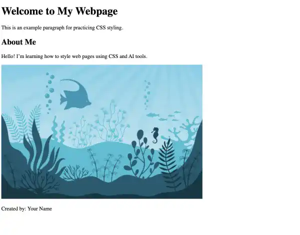
This course takes a hands-on approach, allowing you to apply the techniques covered in real-world scenarios. We'll be using a structured folder layout. Before proceeding with the examples, please ensure the following files are prepared:
/your-project-folder/
    ├── 02-02-basic-css-code/ (<- sub-folder)
        ├── example-1.css
        ├── example-1.html
        ├── example-2.css
        ├── example-2.html
        ├── example-3.css
        ├── example-3.html
        ├── example.jpg
        ├── original.html
Original HTML Code
Copy and paste this code into your original.html file:
<!DOCTYPE html>
<html lang="en">
  <head>
    <meta charset="UTF-8" />
    <meta name="viewport" content="width=device-width, initial-scale=1.0" />
    <title>Basic CSS Styling with AI</title>
    <link rel="stylesheet" href="#" />
    <!-- Update this path to switch examples -->
  </head>
  <body>
    <div class="container">
      <header class="header">
        <h1>Welcome to My Webpage</h1>
        <p>This is an example paragraph for practicing CSS styling.</p>
      </header>

      <main class="content">
        <h2>About Me</h2>
        <p>
          Hello! I’m learning how to style web pages using CSS and AI tools.
        </p>
        <img src="example.jpg" alt="Example Image" class="image" />
      </main>

      <footer class="footer">
        <p>Created by: Your Name</p>
      </footer>
    </div>
  </body>
</html>
Create three copies of the file original.html and rename them to example-3.html, example-2.html, and example-3.html.
Also, create three CSS files (example-1.css, example-2.css, and example-3.css), but you can keep the CSS files blank for now.
Preparing an Image File
For practice purposes, you will need to prepare an image file. To create a sample image, you can use ChatGPT by providing a prompt like this:
“Generate a sample JPG image with a flat illustration that represents 'fish in the ocean'. The image size should be 600x400 pixels.”
Generating the image may take some time due to computing resource requirements, and there could be occasional errors, but you should obtain an image after a few attempts.
If ChatGPT provides only a WEBP format or a different image size, you can ask:
“Give me a JPG file with dimensions of 600x400 pixels.”
Alternatively, you can prepare image files using free download services like Unsplash or Freepik.
Visit this link to see how the original HTML document looks in your web browser.

For your convenience, these files are also available on our GitHub repository. You can download the practice files to follow along with the case studies presented in this guide.
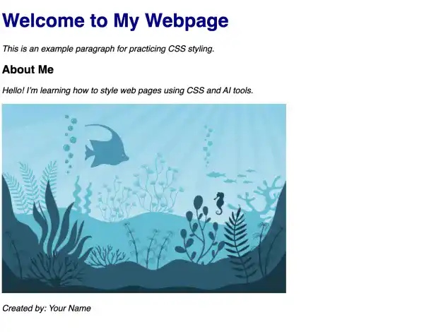
AI Case 1: Customizing Font Styles with AI Prompt
Now that we’ve set up the basic files, let’s customize the font styles using AI-generated CSS prompts. This will allow us to quickly apply changes to text elements like headings, paragraphs, and more.
Sample AI prompt:
Create CSS code to:
- Apply the Roboto font family to the entire document.
- Make the H1 heading bold, change its color to dark blue, and increase its font size to 40px.
- Set the paragraph text to italic and 18px.
Sample code output:
/* example 1 */
/* Apply the Roboto font family to the entire document */
body {
  font-family: "Roboto", sans-serif;
}

/* Style the H1 heading */
h1 {
  font-weight: bold;
  color: darkblue;
  font-size: 40px;
}

/* Style the paragraph text */
p {
  font-style: italic;
  font-size: 18px;
}
Instructions to see the results:
- Copy the code above into
example-1.css. - Update the CSS file path in
example-1.htmlto:href="example-1.css". - Open
example-1.htmlin your browser to see the result.

Visit this link to see how it looks in your web browser.
Background and Border Styling with AI for Basic CSS
Key Properties of Background Styling
Background styling in CSS plays a significant role in the overall design of a webpage, helping to enhance visual appeal and structure content. Several key properties are essential when working with backgrounds, allowing you to apply colors, images, and patterns effectively.
Background Color:
The background-color property sets a solid color behind an element. You can use color names, HEX values, RGB, or HSL to define the color. This property is often used to make content stand out or to define distinct sections of a webpage.
Example:
background-color: #f0f0f0;
Background Image:
The background-image property allows you to set an image as the background of an element. The image can be a URL to an external file or a local file. This property is often used in headers, banners, or full-page backgrounds to create a more dynamic visual effect.
Example:
background-image: url("header-bg.jpg");
Background Size:
The background-size property defines how the background image should fit within the element. Common values include cover (scales the image to cover the entire element) and contain (scales the image to fit within the element without cropping).
Example:
background-size: cover;
Background Repeat:
The background-repeat property controls whether and how the background image is repeated. You can set it to no-repeat, repeat-x, repeat-y, or repeat to specify if the image should be tiled across the element.
Example:
background-repeat: no-repeat;
Background Position:
The background-position property defines the starting position of the background image. It can be set to values like top, center, bottom, left, and right, or using pixel or percentage values for more precise placement.
Example:
background-position: center;
By combining these properties, you can create visually stunning backgrounds that improve your website’s design, ensure readability, and offer a cohesive user experience.
Key Properties of Border Style
Borders in CSS are essential for visually defining the edges of elements and can be used to create emphasis, separation, or a polished look for various parts of a webpage. Several key properties allow you to customize borders effectively, enabling you to control the thickness, style, color, and shape of the borders.
Border Width:
The border-width property defines the thickness of the border around an element. You can specify the width using units like pixels (px), ems (em), or rems (rem). This property allows you to create subtle or bold borders depending on the design needs.
Example:
border-width: 2px;
Border Color:
The border-color property sets the color of the border. You can use named colors, HEX values, RGB, or HSL to define it. Matching or contrasting the border color with other design elements can enhance the visual impact.
Example:
border-color: #3498db;
Border Style:
The border-style property determines the type of border to be applied. Common values include solid, dashed, dotted, double, and none. Each style can give a different feel to the design, from minimalist (solid) to playful (dotted) or dramatic (double).
Example:
border-style: solid;
Border Radius:
The border-radius property is used to round the corners of an element’s border, creating a softer appearance. This is particularly useful for buttons, images, or containers where a less rigid design is desired. You can specify different values for each corner or apply the same radius to all corners.
Example:
border-radius: 10px;
Shorthand Border Property:
CSS provides a shorthand property to apply the border width, style, and color in a single line. This simplifies the code and is commonly used when all aspects of the border are customized together.
Example:
border: 3px solid #e74c3c;
By mastering these properties, you can effectively use borders to frame elements, create visual hierarchy, and add personality to your designs. Borders, when used thoughtfully, can enhance the structure and usability of your website.
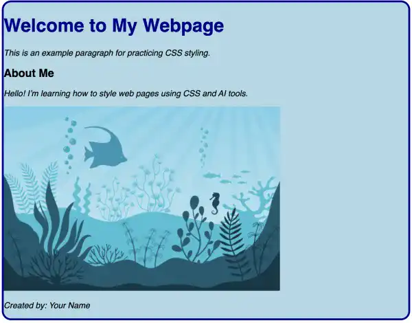
AI Case 2: Customizing Background and Border Styling with AI Prompt
We’ll apply a background color and customize the borders for visual distinction utilizing AI prompts.
Sample AI prompt:
Create CSS code to:
- Add a light blue background to the container.
- Give it a solid 4px dark blue border, and round the corners with a 20px radius.
Sample code output:
/* example 1 */
/* Apply the Roboto font family to the entire document */
body {
  font-family: "Roboto", sans-serif;
}

/* Style the H1 heading */
h1 {
  font-weight: bold;
  color: darkblue;
  font-size: 40px;
}

/* Style the paragraph text */
p {
  font-style: italic;
  font-size: 18px;
}

/* example 2 */
.container {
  background-color: lightblue;
  border: 4px solid darkblue;
  border-radius: 20px;
}
Instructions to see the results:
- Copy the code above into
example-2.css. - Update the CSS file path in
example-2.htmlto:href="example-2.css.". - Open
example-2.htmlin your browser to see the result.

Visit this link to see how it looks in your web browser.
Managing the Box Model, Sizing, and Spacing with AI
What Is the Box Model in CSS?
The CSS box model is a fundamental concept that defines how elements are rendered and how space is managed around them on a webpage. Understanding the box model is essential for controlling the layout, spacing, and sizing of elements, ensuring that your designs behave predictably across different devices and screen sizes.
The box model consists of four key components:
Content:
The content area is the innermost part of the box model and contains the actual text, images, or other elements. The size of the content is determined by the width and height properties of the element.
Example:
.box {
  width: 200px;
  height: 150px;
}
Padding:
Padding is the space between the content and the element’s border. It creates internal spacing, ensuring that the content does not touch the borders. The padding can be set individually for each side (top, right, bottom, left) or applied uniformly to all sides.
Example:
.box {
  padding: 20px;
}
Border:
The border surrounds the padding (or the content if no padding is applied). It provides a visual frame for the element and can be customized in terms of width, color, and style. Borders are a crucial design element used to highlight or separate elements on a page.
Example:
.box {
  border: 2px solid black;
}
Margin:
The margin is the space outside the border, separating the element from other elements. Like padding, margins can be set individually for each side or applied uniformly. Margins do not affect the background color of the element and are crucial for spacing elements within a layout.
Example:
.box {
  margin: 30px;
}
The box model helps designers and developers precisely control the size and spacing of elements. By manipulating the content, padding, border, and margin, you can achieve various layouts, adjust spacing, and maintain a responsive design that adapts to different screen sizes. Understanding how these components interact is key to building well-structured, visually appealing websites.
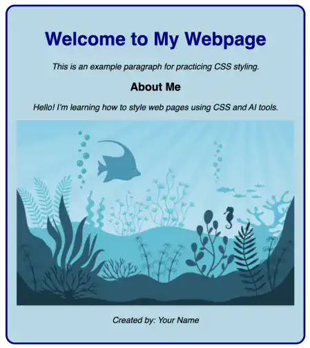
AI Case 3: Adjusting Element Size and Spacing with AI Prompt
For this section, we’ll adjust the image size and add more control over the spacing of elements using margins and padding.
Sample AI prompt:
Create CSS code to:
- Set the image width to 100% of the container, but restrict it to a maximum of 600px.
- Add 20px of padding inside the container and 30px of margin outside the container.
Sample code output:
/* example 1 */
/* Apply the Roboto font family to the entire document */
body {
  font-family: "Roboto", sans-serif;
}

/* Style the H1 heading */
h1 {
  font-weight: bold;
  color: darkblue;
  font-size: 40px;
}

/* Style the paragraph text */
p {
  font-style: italic;
  font-size: 18px;
}

/* example 2 */
.container {
  background-color: lightblue;
  border: 4px solid darkblue;
  border-radius: 20px;
}

/* example 3 */
.container {
  padding: 20px;
  margin: 30px auto;
  text-align: center;
  max-width: 600px;
}

.image {
  width: 100%;
  max-width: 600px;
  height: auto;
}
Explanation:
.container:padding: 20px; adds 20px of space inside the container.margin: 30px auto; adds 30px of space outside the container and centers it horizontally.text-align: center; centers inline elements like text and images.max-width: 600px; restricts the container’s width to a maximum of 600px.
.image:width: 100%; makes the image responsive, filling 100% of the container’s width.max-width: 600px; ensures the image doesn’t exceed 600px in width.height: auto; keeps the image’s aspect ratio intact.
Instructions to see the results:
- Copy the code above into
example-3.css. - Update the CSS file path in
example-3.htmlto:href="example-3.css". - Open
example-3.htmlin your browser to see the result.

Visit this link to see how it looks in your web browser.
Best Practices for Basic CSS Styling
There are many tactics in the Basic CSS styling approaches. Here are some best practices to follow:
- Maintain Readability in Font Styling: When styling fonts, balance aesthetics with readability. Set font sizes and weights suitable for various devices and choose font families that align with your content’s tone. This ensures both legibility and a cohesive design.
- Optimize Backgrounds and Borders: Use background colors and borders to add structure to your page, but avoid overuse. Aim for colors that complement the text and visuals, and keep border styling subtle for a polished look without distractions.
- Master the Box Model: Understand the CSS box model, including padding, margins, borders, and content areas. Define these carefully to create balanced spacing, which is crucial for responsive and user-friendly designs.
By following these best practices, you can achieve clean, scalable, and professional designs that enhance both user experience and visual impact. Embracing AI tools in your CSS workflow allows for rapid iterations, making styling more accessible and efficient.

