Essential Principles of App UI Design

App UI design principles are the foundation for creating interfaces that are not only visually appealing but also offer an intuitive and engaging user experience. These principles guide designers in making thoughtful decisions that enhance usability and ensure that the user interface aligns with the overall goals of the app. There are four fundamental design principles every designer should apply when creating an app UI: Simplicity, Hierarchy, Consistency, and Contrast.
In this section, we’ll cover the following topics.
- Simplicity
- Hierarchy
- Consistency
- Contrast
Simplicity
Simplicity is arguably the most crucial principle in app UI design, particularly for mobile applications where screen real estate is limited. A simple design reduces cognitive load on the user, making it easier to navigate and interact with the app. Simplicity is not about stripping away functionality; rather, it’s about making deliberate choices to present the most important information clearly and concisely.
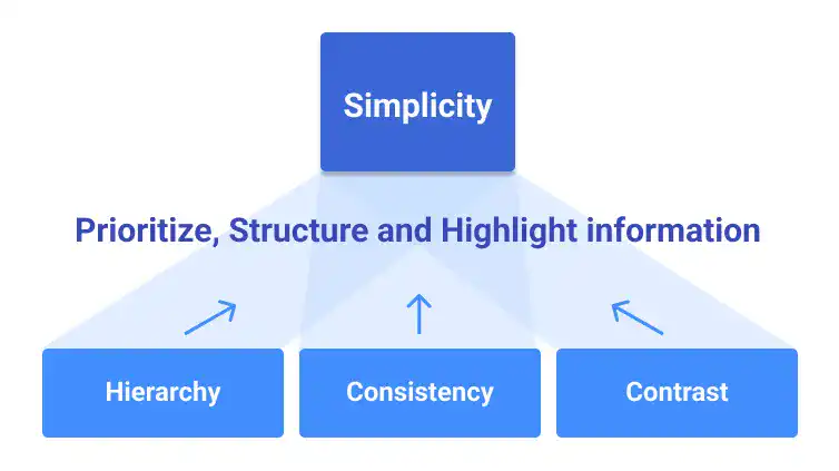
Simplicity in design is closely tied to the other three principles—Hierarchy, Consistency, and Contrast—which together help create a streamlined and user-friendly experience.
Simplicity in app UI design is achieved by following a structured approach that focuses on what matters most to the user. Here’s a step-by-step process to implement simplicity:
- Prioritization:
- Identify and prioritize the key information or actions that should be presented on each screen.
- Avoid overloading the interface with too much content to prevent visual noise.
- Hierarchy:
- Convert prioritized information into a visual hierarchy, structuring it in a way that guides users through the content efficiently.
- Consistency:
- Ensure that all design elements are consistent across the app to eliminate unnecessary distractions and maintain focus on key information.
- Contrast:
- Highlight important elements by applying contrast, helping users to quickly identify and interact with essential features.
Hierarchy
Hierarchy in UI design refers to the organization of elements in a way that guides the user’s attention and actions in a logical sequence. Effective hierarchy ensures that users can easily identify the most important information and navigate through the app without confusion. This principle is essential for structuring the layout, organizing content, and improving overall usability.
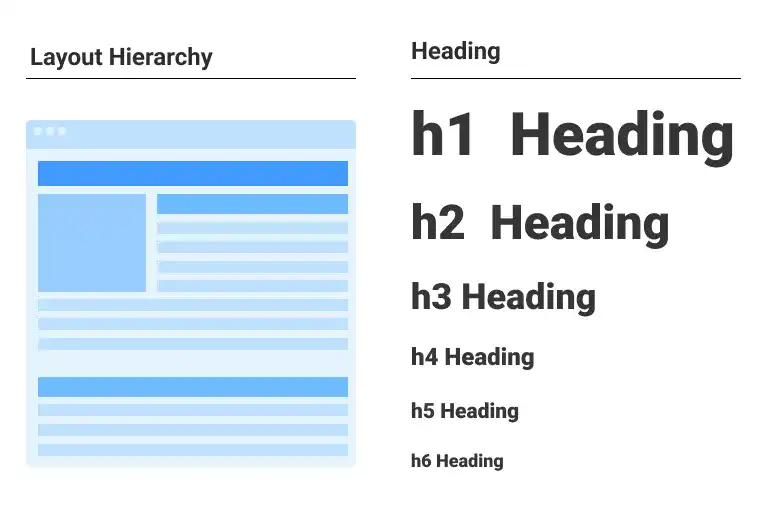
Hierarchy is not just about layout but involves several layers of design considerations:
- Design Layout: The first and most crucial step in applying hierarchy is through the layout. Organize the interface to align with natural reading and scanning patterns, typically starting from the top or left side of the screen.
- Heading Hierarchy: Establish a clear typographic hierarchy with different text sizes and weights to differentiate headings, subheadings, and body content.
- Color Hierarchy: Use color strategically to emphasize the most critical elements, making sure that stronger colors draw more attention.
Hierarchy also involves considering the device type (e.g., mobile, tablet, desktop) and screen size when designing the layout, as different devices may require different approaches to effectively guide the user.
Consistency
Consistency is a critical aspect of UI design that helps to establish a sense of familiarity and predictability for users. A consistent interface reduces the learning curve, allowing users to interact with the app more efficiently because they know what to expect. Consistency should be maintained across all design elements, including layout, colors, typography, and interaction patterns.
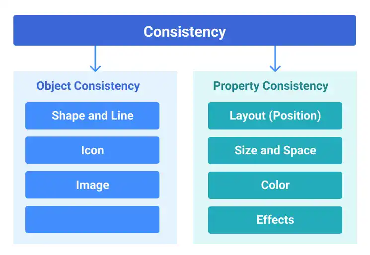
Consistency in design helps create an intuitive and predictable user experience. Consider these areas to ensure consistency:
- Uniform design elements: Ensure that buttons, icons, and other UI elements follow the same design language throughout the app.
- Consistent interactions: Standardize how users interact with the app, such as the placement of navigation buttons or the way content is displayed, so that users can easily anticipate outcomes.
- Visual harmony: Maintain a consistent color palette, typography, and spacing to create a cohesive look and feel.
Here are examples of different types of consistencies.
Consistency in Shapes
- Ensuring that similar shapes are used consistently throughout the design helps create a cohesive visual language, making the UI more intuitive and visually harmonious.

Consistency in Icons
- Using a consistent style, size, and placement for icons across the app enhances usability and ensures that users can easily recognize and understand their functions.

Consistency in Images
- Maintaining uniformity in the style, resolution, and placement of images ensures that the visual presentation is coherent, reducing distractions and enhancing the overall aesthetic.

Consistency in Fonts
- Applying consistent typography—such as font families, weights, and sizes—across all text elements ensures readability and a unified look, making the content easier to consume.

Consistency in Layout (Alignments)
- Keeping a consistent alignment for elements ensures that the layout is orderly and predictable, which improves user navigation and the overall user experience.

Consistency in Size and Space
- Uniform sizing and spacing of elements prevent visual clutter and help create a balanced design, making the interface easier to scan and interact with.

Consistency in Color
- Using a consistent color palette across the app reinforces brand identity and creates a visually pleasing interface, while also guiding user behavior through color-coded actions.

Consistency in Effects
- Applying effects like shadows and blurs consistently across similar elements enhances depth and focus, contributing to a cohesive and polished design.

Consistency not only enhances usability but also strengthens the app’s branding by creating a unified and professional appearance.
Contrast
Contrast is used to draw attention to the most important elements on the screen, ensuring that key information stands out and is easily recognizable. Contrast can be achieved through differences in color, size, shape, and even texture, allowing designers to create visual interest and emphasize certain aspects of the UI.
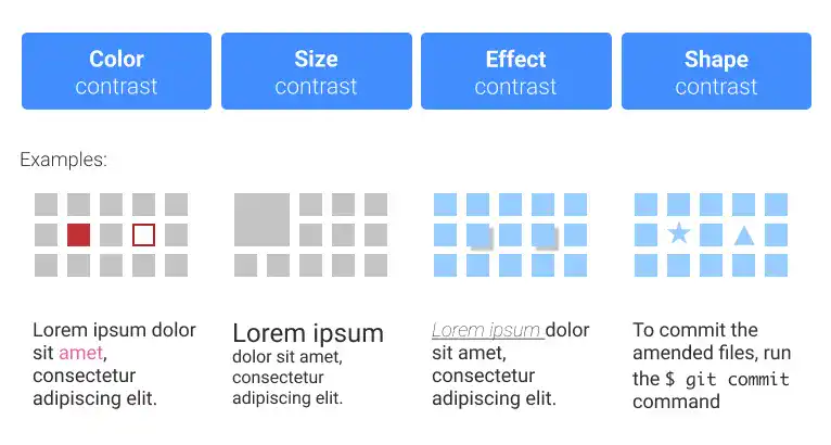
Contrast is essential for making important elements stand out:
- Color Contrast: Select contrasting colors for background and foreground elements to make the interface more readable and visually appealing.
- Size Contrast: Vary the size of elements to create a hierarchy, ensuring that the most important elements are more prominent.
- Effect Contrast: Use visual effects like drop shadows or blurs to highlight key elements and create depth.
- Shape Contrast: Incorporate different shapes to distinguish between various types of content or interactive elements, enhancing usability.
You can use two or more contrast approaches at the same time to increase effectiveness of contrasts. The image below is an example of the hover effect achieved by a combination of multiple contrasts (size, color and drop shadow).

When applied thoughtfully, contrast can significantly improve the user experience by making the interface more navigable and visually engaging.
By integrating these principles into your app UI design process, you can create interfaces that are not only aesthetically pleasing but also highly functional and user-centric. Each principle plays a vital role in enhancing the overall user experience, making your app more intuitive, accessible, and enjoyable to use.
Accessibility and Inclusion

Accessibility is about making services and products usable by the widest possible range of individuals, regardless of their physical abilities. In app UI design, accessibility ensures that your design is inclusive and user-friendly for everyone. One of the key aspects of improving accessibility is ensuring sufficient color contrast. This is crucial because millions of people worldwide have color vision deficiencies, making it essential to design with this in mind.
To create a more inclusive app UI, it’s important to verify that your color choices are accessible to all users. There are various tools available to check the color contrast of your design. For Figma, several plugins can assist with this, including Stark, one of the most popular options.
Check out Stark here: Stark Plugin for Figma

