Understanding Key Elements in App UI Design

Creating an effective App UI design involves mastering the manipulation of various UI design elements, often referred to as objects in design tools. These elements form the visual and functional foundation of your app, ensuring that it is both user-friendly and visually engaging. Understanding the two dimensions of these elements—Object Type and Object Property—is essential for any designer looking to create a seamless user experience.
In this section, we’ll cover the following topics.
- Object Type
- Object Property
Object Type
1. Shape and Line

Shapes and lines are the most fundamental building blocks of all design elements. Whether you're designing icons, crafting images, or setting up fonts, everything in your design ultimately stems from shapes and lines. In most modern design tools, these are created using vector graphics, which allows for scalability without loss of quality. Vector-based shapes and lines are essential for creating responsive designs that work across various screen sizes and resolutions.
Practical Tip: Utilize vector graphics for creating shapes and lines to ensure your designs remain crisp and scalable on all devices.
2. Icon (Iconography)

Iconography plays a crucial role in UI design by using visual symbols to convey information efficiently. Icons help reduce the need for lengthy text explanations, making your design cleaner and more intuitive. The strategic use of icons can simplify navigation, improve usability, and enhance the overall user experience.
Practical Tip: Choose icons that are universally recognized and relevant to the app's functionality. Ensure that your icons are consistent in style and size to maintain visual harmony.
3. Image

Images are vital in UI design, often serving as backgrounds, logos, or key visual content. They can greatly enhance the aesthetic appeal and functionality of your app. When incorporating images, it's important to consider their file types and resolutions to ensure they load quickly and display correctly across all devices. Formats like SVG, PNG, and JPEG are commonly used, each with its own advantages depending on the context.
Practical Tip: Use SVG for icons and simple graphics because it's scalable and lightweight. PNG is ideal for images requiring transparency, while JPEG is suitable for complex images like photos.
4. Text (Typography and Font)
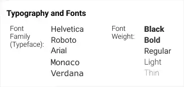
Text is a unique object type in UI design with its own set of properties that need to be carefully controlled. Typography not only involves selecting a font family but also adjusting properties like font weight, size, line height, letter spacing, and more. These adjustments are crucial for readability and aesthetic consistency across your app.
Practical Tip: Stick to one or two font families to maintain consistency. Use different weights and sizes to create hierarchy and emphasis within your text.
Object Property
1. Layout (Position)
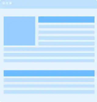
The layout is the backbone of UI design, determining where each design element is placed on the screen. A well-structured layout guides users through your app in a logical and intuitive way. It is defined by the x-y coordinates of the top-left corner of each object and is heavily influenced by the design principle of hierarchy.
Practical Tip: Start with a grid system to ensure your layout is well-structured and consistent. This will help maintain alignment and balance in your design.
2. Size and Space
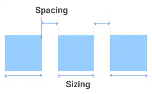
Size and space are crucial for creating a balanced and aesthetically pleasing UI. While the size of each object is important, the spacing between elements is equally critical to avoid visual clutter and to ensure that the design is easy on the eyes.
Practical Tip: Use white space effectively to avoid overcrowding. Proper spacing between elements helps in reducing cognitive load and improving user experience.
3. Color
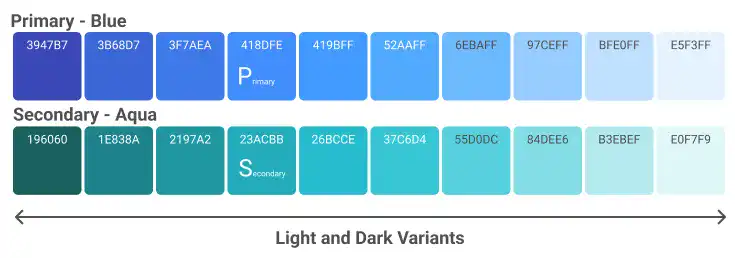
Color is one of the most impactful properties in UI design. It can evoke emotions, guide user behavior, and enhance usability. Establishing a consistent color palette is essential for maintaining visual harmony throughout your app. A well-defined palette typically includes primary and secondary colors along with light and dark variants to cover various UI scenarios.
Practical Tip: Utilize tools like Google’s Material Design to create a cohesive color palette that aligns with your brand identity and user expectations.
4. Effects
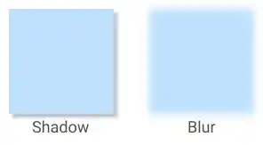
Effects such as shadows, blurs, and gradients are used to add depth and visual interest to your design elements. When used sparingly, these effects can draw attention to specific elements, create a sense of hierarchy, and improve the overall user experience.
Practical Tip: Apply effects like drop shadows to make interactive elements such as buttons more prominent, but avoid overusing them to maintain a clean design.
Mastering the manipulation of these App UI design elements—shapes and lines, icons, images, text, layout, size and space, color, and effects—allows you to create user interfaces that are not only visually appealing but also functional and intuitive. Each element has its own role, and when used effectively in combination, they can elevate your app’s user experience to the next level. By understanding both the object types and properties, you can ensure your designs are consistent, scalable, and aligned with best practices in UI design.

