App UI Design Basics: Essential Steps for Beginners

Creating a user-friendly app UI design requires a thoughtful approach that balances aesthetics with functionality. The key to achieving this lies in understanding and applying essential App UI Design Elements such as shapes and lines, icons, images, text, layout, size and space, color, and effects. These elements form the building blocks of your design, each playing a crucial role in how users interact with your app. Incorporating core App UI Design Principles—simplicity, hierarchy, consistency, and contrast—is vital to ensuring that your design is intuitive and visually appealing. Simplicity helps in reducing clutter, making navigation straightforward. Hierarchy guides users through the content in a logical order, while consistency ensures that elements behave predictably across the app. Contrast is used to highlight key features and actions, making them stand out to the user.
The App UI Design Process involves several stages that build upon each other to refine both design and functionality, ultimately creating an engaging and efficient user experience. These stages include concept design, wireframing, mockup creation, and prototyping. Each step is crucial in ensuring that the final design is not only visually compelling but also aligns with user needs and business goals.
In this section, we’ll cover the following topics.
- App UI Design Elements and Design Principles
- App UI Design Processes
App UI Design Elements and Design Principles
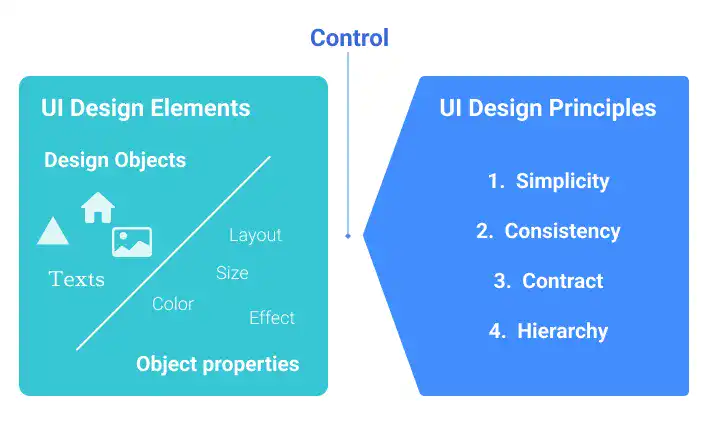
Understanding App UI Design Elements and App UI Design Principles is crucial to mastering UI design. App UI Design Elements focus on the "what" of design—what you need to control, such as object types (shapes, icons, images, text) and object properties (layout, size, space, color, effects). App UI Design Principles, on the other hand, provide the "how"—the rules for creating a better UI, including simplicity, hierarchy, consistency, and contrast.

App UI Design Elements
App UI design revolves around managing design elements, often called objects, which have two dimensions: object type and object property. Mastering these dimensions is crucial for creating effective and user-friendly interfaces.
Object types include:
- Shapes and Lines: The foundation of all design objects, including icons, images, and fonts, are created using vector graphics.
- Icons (Iconography): Visual symbols used to convey information succinctly, simplifying the design.
- Images: Photos or illustrations used for backgrounds, logos, or content, requiring careful attention to file formats and resolutions.
- Text (Typography and Font): Text is unique, with various properties like font family, weight, line height, and letter spacing needing precise control.
Object properties include:
- Layout (Position): Determines where objects are placed within the design, based on x-y coordinates.
- Size and Space: Critical for creating a visually appealing layout by managing the dimensions of objects and the space between them.
- Color: Essential in graphic design, with careful selection and consistency achieved through a predefined color palette.
- Effects: Tools like shadows and blur are used to enhance or decorate design elements.
By understanding and applying these elements and properties, designers can create balanced and effective app UIs. More details on App UI Design Elements will be explained later in this Chapter.
App UI Design Principles
UI design principles are essential for crafting user-friendly interfaces, with four key principles guiding the process: Simplicity, Consistency, Contrast, and Hierarchy.
Simplicity
Simplicity is the cornerstone of app UI design, especially crucial for mobile apps with limited space. It involves prioritizing information, structuring it effectively, and using contrast to highlight key elements. This principle is executed through the rigorous application of hierarchy, consistency, and contrast, ensuring that users can navigate the app intuitively.
Hierarchy
Hierarchy structures the layout, allowing information to be delivered in a clear and logical order. This is particularly important for app UI, where users typically start interacting from the top or left of the screen. Effective hierarchy adapts to different devices and screen sizes, guiding user flow through thoughtful placement of elements like navigation bars and text headings.
Consistency
Consistency eliminates visual noise by ensuring uniformity across all design elements, from shapes and icons to colors and fonts. This uniformity enhances the impact of contrast by creating a stable baseline against which important information can stand out.
Contrast
Contrast is used to emphasize high-priority information, making it easily identifiable. This can be achieved through variations in color, size, effects, or shapes, often using multiple contrast techniques simultaneously for greater impact.
These principles collectively ensure a coherent and engaging user experience. More details on App UI Design Principle will be explained later in this Chapter.
App UI Design Processes
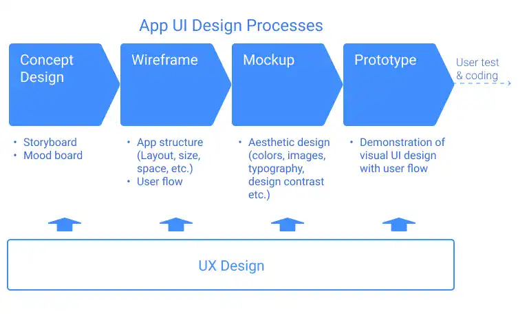
A well-rounded app UI design process typically follows four key stages, each of which contributes to the overall effectiveness and user experience of the final product. This structured approach ensures that the design is both user-centric and aligned with the overall UX strategy.

1. Concept Design
The design process begins with concept design, which sets the foundational vision for the app. Here, two primary approaches are often used:
- Storyboard: This approach involves outlining the problem the app aims to solve and mapping out the user journey without diving into visual details. It’s a narrative-driven method that helps clarify the app's functionality and purpose.
- Moodboard: In contrast, a moodboard focuses on the visual direction of the app. It’s a collection of images, colors, typefaces, and design elements that convey the desired aesthetic, setting the tone for the app’s look and feel.
2. Wireframing
Wireframing is the next step, where the app's structure and layout are defined. At this stage, designers concentrate on the arrangement of UI elements, size, spacing, and the overall flow between screens. Wireframes are typically devoid of detailed visual elements, allowing designers to focus on the user journey and functionality.
3. Mockup Design
Once the wireframe is established, the design process moves to the mockup stage. Here, the app's visual identity is brought to life by applying the aesthetic elements defined in the moodboard. Designers finalize the color scheme, typography, imagery, and other visual components, ensuring the mockup represents the final product as closely as possible.
4. Prototyping
The final step in the process is prototyping, where the app’s interactive elements are designed and tested. Prototypes simulate the user experience by linking UI elements to actions—such as buttons that navigate to different screens—allowing designers to refine the user journey and gather feedback before development begins.
Each stage of the app UI design process is crucial for creating a cohesive and user-friendly product. Figma is an invaluable tool throughout these stages, offering features like templates and plugins to streamline the workflow and enhance productivity.
We’ll delve deeper into the Concept Design process later in this chapter. Subsequent chapters will cover Wireframing, Mockup Design, and Prototyping in greater detail. By mastering these processes, you’ll be well-equipped to create app UIs that are not only visually appealing but also intuitive and functional.