Creating App Concept Storyboards with Figma

Creating a compelling app concept begins with a well-structured storyboard that captures the essence of your idea without getting bogged down in visual details. A clear and thoughtful storyboard not only helps define the direction of your app but also provides a solid foundation for making detailed design decisions as the project progresses. You can also utilize a moodboard, a visual tool that helps set the aesthetic direction for your app. Figma offers useful templates for creating a moodboard.
In this section, we’ll cover the following topics.
- Storyboard
- Moodboard
Storyboard
In App UI concept design, a storyboard is a visual representation of the user experience flow through an application. It maps out each screen or interface and shows how users will navigate from one screen to another, effectively telling the "story" of how the app will be used. There are some key questions you can ask yourself to define the storyboard.
Key Questions to Guide Your Storyboard creation:
1. Who are the target users?
Defining your target audience is the first step in app development. The UI/UX design should be tailored specifically for these users, considering their needs, preferences, and potential pain points. This understanding will drive the design choices and features that cater to your audience effectively.
2. Why do they need the app? (Value Proposition)
Understanding and clearly articulating the app’s value proposition is crucial. This involves identifying the unique benefits your app offers to its users. Why would someone choose your app over others? Conduct market research and user interviews to ensure your app solves a real problem and offers tangible value to its users.
3. What are the key features?
Before diving into wireframing or mockups, you need to outline the app’s core functionalities. Focus on the essential features that meet your users' needs and address the app’s primary purpose. Starting with a Minimum Viable Product (MVP) approach helps set priorities, ensuring that the most critical features are developed first, with additional features added as needed.
4. What type of aesthetic design will be used?
While detailed visual design can be refined later, having an early vision of the aesthetic direction is beneficial. Consider the app’s branding, target audience, and the emotional tone you want to set. A clear aesthetic direction will guide your design decisions during the mockup and prototype stages, ensuring consistency and appeal.
These four elements are the foundational requirements for your design concept. However, depending on your project, additional factors like the monetization model, competitive landscape, and long-term scalability might also be crucial.
Design Concept Example
Target Users:
The app is aimed at closed communities, such as childcare centers or nursing homes, where daily photo sharing between staff and families is a priority. These communities may not prefer using mainstream social media due to privacy concerns.
Value Proposition:
The app provides a secure platform for sharing daily photos and messages within a closed community, ensuring that users can stay connected without compromising information security.
Key Features:
- User registration
- Community creation and member invitations
- Photo and message uploads
- Editing and deleting posts
- Commenting and liking posts
- Viewing posts in list and detail formats
- Community management (viewing and interacting with multiple communities)
- Login/Logout functionality
- User profile management
Aesthetic Design Direction:
The design will be minimalistic and modern, catering to a diverse user base with varying backgrounds. The aesthetic will be simple and inclusive, with a focus on ease of use for elderly users.
Moodboard
A moodboard is a visual tool that helps in setting the aesthetic direction for your app. It’s a collection of images, colors, typefaces, and other visual elements that convey the design style you want to achieve.

Using Figma for Moodboarding
Figma offers templates and tools that make creating a moodboard straightforward.
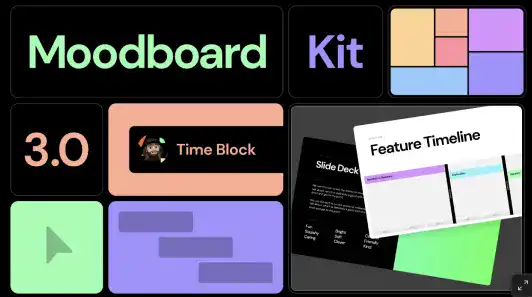
By using Figma’s Moodboard Kit 3.0, you can streamline the process and focus on gathering and organizing your visual inspiration.

Steps to Create a Moodboard:
- Set Up Your Moodboard: Start by duplicating the Figma Moodboard Kit 2.0 template into your Figma workspace. This template provides a structured layout for organizing your visual elements.
- Collect Visual Inspiration: Gather images that align with your design concept. Use platforms like Pinterest to search for visuals that reflect the themes and aesthetics you’re aiming for. Keywords such as “accommodative,” “nature,” “sustainability,” “family,” and “community” can guide your search.
- Automate Image Insertion with Google Sheet Sync: Use the Google Sheet Sync plugin to automate the process of placing images into your moodboard. Simply list the image URLs in a Google Sheet, and the plugin will populate your Figma moodboard with these images, saving time and ensuring accuracy.
- Finalize Your Moodboard: Once all images are in place, refine your moodboard by adjusting the layout, adding annotations, or tweaking the visual elements to align with your design vision.
Example Moodboard
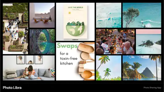
For a photo-sharing app designed for closed communities, the moodboard might include images that evoke a sense of connection, warmth, and inclusivity. The color palette could be soft and welcoming, with typefaces that are clean and easy to read, ensuring accessibility for all users.
Visual Example:
- Keywords: Accommodative, Nature, Sustainability, Family, Community
- Color Palette: Earth tones with accents of green and blue
- Typography: Sans-serif fonts for clarity and modernity
By following these steps, you can create a comprehensive and cohesive app concept that lays the groundwork for all subsequent design stages. A well-crafted storyboard and moodboard not only clarify your vision but also communicate it effectively to stakeholders and team members, ensuring everyone is aligned as the project moves forward.

Other Useful Tools for Moodboard Creation
Google Sheet Sync Plugin
This plugin is incredibly helpful for automating the process of inserting collected images into the Figma Moodboard template. Simply gather the image URLs you want to use in a Google Sheet, and the plugin will handle the rest.
Pinterest is a useful social media specializing in image search. This media can help you find relevant images you are looking for. To get the image URL, open the image in a new window or new tab.